How to Create a Waffle Chart in Excel
Want to make your data presentations more visually engaging? Waffle Chart is a good choice for Power Point presentations. In this lesson, you learn how to insert a Waffle Chart in Excel.
Prepare data
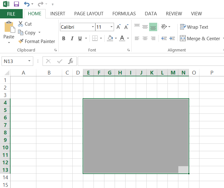
To start preparing a Waffle Diagram in Excel you need to prepare chart area. I did it for 10 x 10 cells area what is the most used for that type of chart. As you see on the picture below, I set grey color for cells background and changed font color to grey.

Conditional formatting
Next, you need to set conditional formatting for cells inside a chart area. To do it go to ribbon and click Conditional Formatting -> New Rule.

New Formatting Rule should be set for cells that contain equal to TRUE value. You need to click Format button and set Font color and Fill to the same color. I chose blue.

The formula
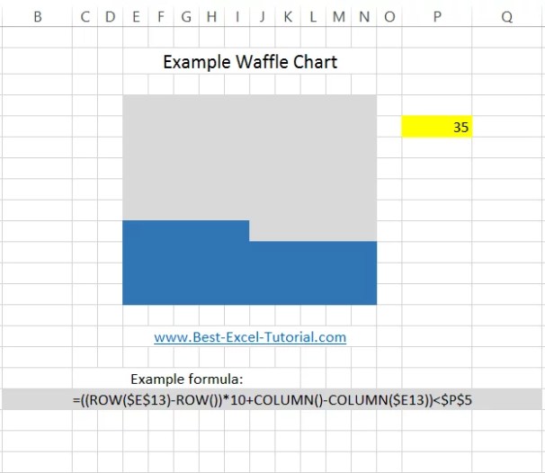
Next, click the first cell in your chart area and use this formula: =((ROW($E$13)-ROW())*10+COLUMN()-COLUMN($E13))<$P$5
Drag and drop the cell and set it for every cell in the whole area.

The chart
The last step is the value. Type some value to the P5 cell to check if the Waffle Chart is working properly.

In the end you can to format you chart.

After formatting the chart, your waffle graph can look much more polished and visually engaging, like this example.

For a more visually appealing chart, you can remove gridlines (View > Gridlines) and adjust cell borders to create a clear separation between the filled and unfilled cells. Using a square cell format (adjusting row height and column width to be equal) will also enhance the visual representation.


Stevie
I’m super confused about this formula you’ve used: =((ROW($E$13)-ROW())*10+COLUMN()-COLUMN($E13))<$P$5. Like, what's going on here? 🤔 It's like trying to read hieroglyphics. How does this magic spell work in deciding which cells turn blue? I'm trying to make a Waffle Chart for my cat's birthday party stats (yes, I throw parties for my cat 🐱🎉), and I'm lost!