How to Create Pivot Chart in Excel
In this lesson, you can learn how to create a pivot chart in Excel.
Table of Contents
Data preparation
A pivot chart is similar to the traditional chart format, but has some additional features useful for the analysis of data.
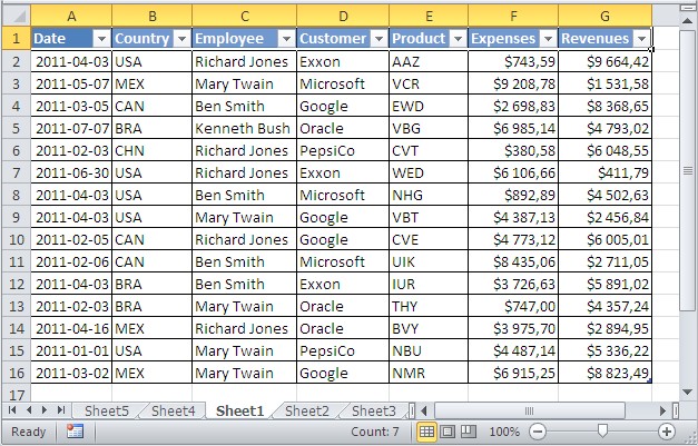
I have prepared table with sales data:

Ensure that your data is organized in a way that makes it easy to create data summary tables and related visualizations. This may involve organizing your table or using Excel’s sorting and filtering options to prepare your information effectively.
Creating Your Visualization
Next, go to the Ribbon. Click Insert > PivotTable > PivotChart option.

When you choose this option, Excel will guide you through selecting your data range and will automatically create both a data summary table and an interactive visualization linked to it. Choose the range of your table with headers in the dialog box that appears.

You can use the data summary table as the data source. Now you can customize your visualization by selecting specific fields to display.

Choose the fields which you want to add to your visualization from the field list menu.

Here’s how your visualization looks once fields are added. It displays your data interactively, allowing you to easily filter and rearrange information directly within the display for better insights and analysis.

Customize the appearance of your visualization to make it look professional and easy to understand. You can click the filter buttons on the display (like Country or Customer) to filter and drill down into specific values for detailed analysis.

Key Benefits and Advanced Features
This method provides significant advantages for data analysis and reporting. The interactive nature allows for real-time filtering and exploration without manually updating your source data. You can drill down into specific categories, compare trends, and identify patterns quickly. The linked relationship between the data summary table and visualization ensures consistency and automatic updates whenever your source data changes. This makes it ideal for creating professional reports and dashboards.
Excel also creates a corresponding data summary table in your spreadsheet alongside the visualization.

You can modify your visualization by adjusting the data summary table. It reflects the same values you see in your table, maintaining real-time synchronization.
Try to update, filter, or change data in the summary table and see how your visualization changes instantly. This dynamic relationship is what makes this feature so powerful for data exploration and decision-making.


Leave a Reply