How to Create Min/Average/Max Column Chart in Excel
In this Excel charting tutorial, you will learn how to create a column chart with min average max values in Excel. You’ll discover how to visualize minimum, average, and maximum values using a professional column chart format with step-by-step instructions.
Preparation of min max average data for a chart
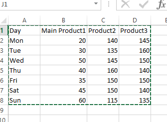
Please find below the sales data for a week for six items:

Let us insert 3 rows for max, min and avg values:

Now we have to use formulas to calculate the Max, Min And Average as shown below:
Max: =MAX(B5:B11)
Min: =Min(B5:B11)
Avg: =Average(B5:B11)


Inserting a min max average chart
With the prepared minimum, average, and maximum values ready, you can now build your min/average/max column chart. To create this visualization, select all the data including the Max, Min, and Average rows for each item.

Create a 2d column chart:

It will create the chart as shown below:

So for each item, we have the Max(blue), Min(grey) and Average(Orange) bars as shown.
We can also convert this to a line chart if required as well. Right-click on the chart area and select “change chart type”.

By following these steps, you can create a column chart in Excel that displays the minimum, average, and maximum values for a set of data. This can be a useful way to visualize and compare data and draw conclusions from it.


Leave a Reply