How to Plot a Line Graph in Excel
In this lesson, you can learn how to plot line chart in Excel.
You can use a line chart to show changes in trends over the time. In this case, we focus on sales.
Table of Contents
Prepare Data
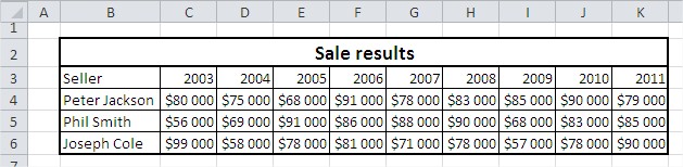
Prepare the necessary data in the table. First row contains time periods (years) and subsequent rows sales figures for each series.

Ensure your sales data is neatly arranged in a table format, ready for charting.

Select Data
Select the range of cells containing your sales data, including both the dates/categories (e.g., years) for the horizontal axis and the sales values for the vertical axis. For example, if your years are in B3:K3 and your sales figures are in C4:K6, select the range B3:K6.

Insert Line Chart
Go to the ribbon. Here you find the Insert tab. Click the button Line to plot Line Graph.

From the drop-down menu select the first of the charts (2-D Line Chart).

Improve the Chart
Customize the chart by adding a title.

You can do this by going to the “Layout” tab and clicking on “Chart Title” to enter a title for your chart.

Modify Axis Labels
Right-click on the data series in the chart and select “Select Data”.

In the dialog box that appears, edit the horizontal axis labels. Then choose the range axis labels. Select the year from the table data. Selecting the correct horizontal axis labels ensures that the chart accurately represents the data, with each data point correctly associated with its corresponding date or category. The data series in the chart now looks as it should.

Finalize and Customize
You can further customize the chart by changing colors, adding data labels, adjusting gridlines, and more to make it visually appealing and informative.

A well-formatted line chart makes trends and fluctuations in sales data immediately apparent and supports data-driven decision-making.


Leave a Reply