Best Excel Tutorial
Excel Skills Simplified: Tutorials That Actually Work
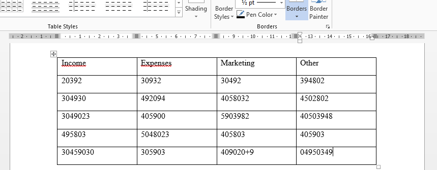
How to Convert Word documents to Excel?
Converting a Microsoft Word document to Microsoft Excel can be a straightforward process using a simple copy and paste method. We will walk you through the steps to convert a Word document to Excel seamlessly.
How to calculate GST?
GST stands for Goods and Services Tax. GST is a value-added tax that is applied to the sale of goods and services in many countries, including India, Canada, and Australia. Calculating GST is going to be made easy, with these simple steps.
How to Insert Picture into Excel Cell
Excel makes it easy to insert pictures into your spreadsheets. This can be useful for adding visual interest, illustrating data, or creating custom charts and graphs.
How to Calculate EMI in Excel?
With these simple steps, we are going to learn how to calculate the EMI. The EMI is the Equated Monthly Installment. It is easy to calculate the EMI in Excel. It can be used to calculate the EMI of your mortgage, car loan, or any other loan.
It is important to calculate the EMI to be able to manage your household budget. The lower the monthly installment, the more money you have for other expenses.
How to Calculate Correlation in Excel
The correlation coefficient is a statistical measure that represents the strength and direction of the relationship between two variables.
In Microsoft Excel, you can calculate the correlation coefficient using the CORREL function. The CORREL function in Excel calculates the Pearson correlation coefficient, which specifically measures the strength and direction of linear relationships between two sets of data. I will show you how to calculate the correlation coefficient in Excel and how to interpret the results.
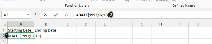
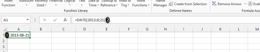
How to calculate Length of Service?
To calculate the length of service in Excel, you need to determine the number of days, months, or years between two dates. Here’s how to do it:
How to calculate XIRR Annualized Return
The understanding of the usefulness of the XIRR function in Excel varies for different reasons. There are some that would find it useful for one thing, while it might be useful for other things. It is practically useful for anything that has to do with calculating your returns.
When it comes to investing money, there are actually differences in time value. When depositing and withdrawing money and then receiving dividends, it becomes much more difficult to make the calculation of the annualized returns.
This is because there is certainly a difference between making an investment of $1,000 in January and investing the same amount in December, right before the year ends. This makes the XIRR feature of Microsoft Excel something that simplifies the calculation.
How to Overlay Graphs in Excel
Overlay graphs are a powerful tool for data visualization. They allow you to compare multiple data series on the same graph, which can help you to identify trends and patterns that would be difficult to see if the data was presented in separate graphs.
In this Excel tutorial, you learn how to overlay graphs in Excel. We will also discuss the benefits of using overlay graphs and some tips for creating effective overlay graphs.