How to calculate Modal?
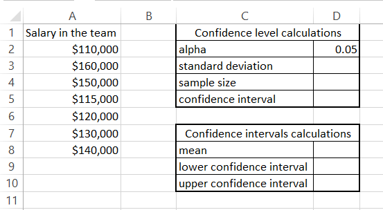
The modal is the number that most often appears. We are going to learn how to calculate the modal with these simple steps.
The Largest Excel Knowledge Base ✅ The Best Place to Learn Excel Online ❤️
The modal is the number that most often appears. We are going to learn how to calculate the modal with these simple steps.
Excel makes it easy to insert pictures into your spreadsheets. This can be useful for adding visual interest, illustrating data, or creating custom charts and graphs.
With these simple steps, we are going to learn how to calculate the EMI. The EMI is the Equated Monthly Installment. It is easy to calculate the EMI in Excel. It can be used to calculate the EMI of your mortgage, car loan, or any other loan.
It is important to calculate the EMI to be able to manage your household budget. The lower the monthly installment, the more money you have for other expenses.
The correlation coefficient is a statistical measure that represents the strength and direction of the relationship between two variables.
In Microsoft Excel, you can calculate the correlation coefficient using the CORREL function. I will show you how to calculate the correlation coefficient in Excel and how to interpret the results.
To calculate the length of service in Excel, you need to determine the number of days, months, or years between two dates. Here’s how to do it:
The understanding of the usefulness of the XIRR function in Excel varies for different reasons. There are some that would find it useful for one thing, while it might be useful for other things. It is practically useful for anything that has to do with calculating your returns.
When it comes to investing money, there are actually differences in time value. When depositing and withdrawing money and then receiving dividends, it becomes much more difficult to make the calculation of the annualized returns.
This is because there is certainly a difference between making an investment of $1,000 in January and investing the same amount in December, right before the year ends. This makes the XIRR feature of Microsoft Excel something that simplifies the calculation.
Overlay graphs are a powerful tool for data visualization. They allow you to compare multiple data series on the same graph, which can help you to identify trends and patterns that would be difficult to see if the data was presented in separate graphs.
In this Excel tutorial, you learn how to overlay graphs in Excel. We will also discuss the benefits of using overlay graphs and some tips for creating effective overlay graphs.
A kite chart is a perfect diagram that graphically enlightens the way that the abundance of various species changes at different places in the same line. Density is found by measuring each of a series of survey areas, which are called quadrats.
This is usually taken at a measuring distance along a transect, which is a suitable line that goes through a habitat that usually changes. It is possible to measure it in units of some kind, or even as a percentage of coverage, while counting the impracticable individuals.
It is possible for a kite chart to show the abundance of key marine species while moving from a splash zone to below the low tide mark on the rocky shore.
Inserting multiple drop-down lists that are somehow linked together in Excel is very simple. It is about having the understanding of what is linking these lists together. We are going to create the lists together and further insert the drop-down list. I am going to use Microsoft Excel to do this drop-down list.
Flowcharts visually represent a process or workflow, making it easier to understand and analyze complex decision-making processes. We are going to create a flowchart using Microsoft Excel.