How to insert a Treemap in Excel?
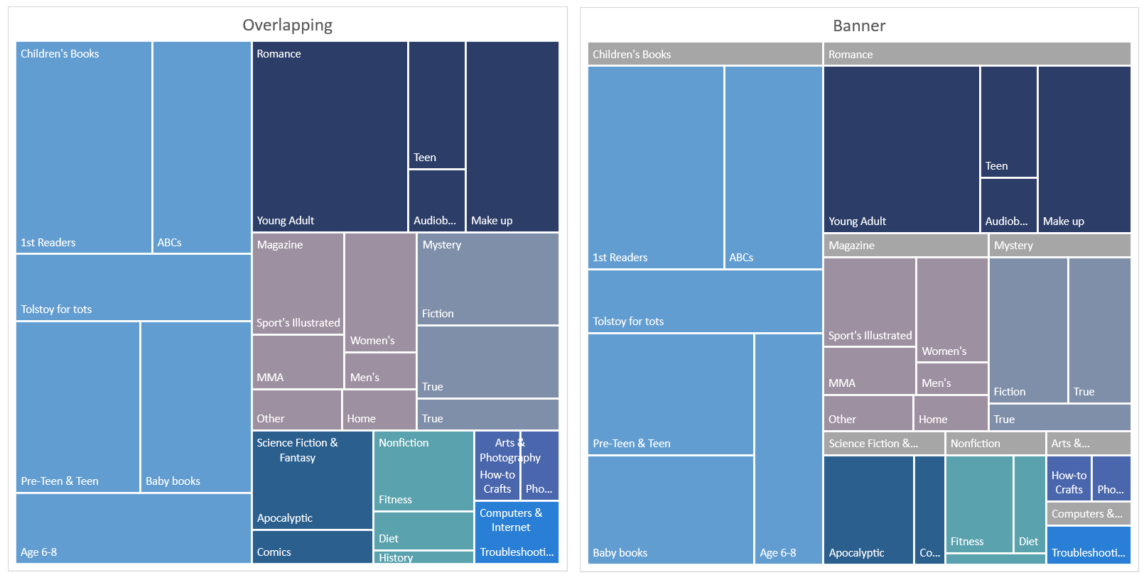
A treemap chart is a chart that displays hierarchical, tree-structured, data using nested rectangles.
The tree branches are represented by rectangles and they are tiled with smaller rectangles that represent sub-branches. It displays categories by color and proximity, which is great if you want to easily show a lot of data.
How to create one?
First, you will need a set of data that you want to be represented in the treemap chart.
Then you are going to follow these steps:
- Select the entire data set that you want to convert, and go to the “Insert” tab that is located on the ribbon.
- Then select “Insert Hierarchy Chart” and select Treemap.
And that’s how you add a treemap chart, but you can also do it in another way:
- Select the entire data set, and go to the “Insert” tab that is on the ribbon.
- Then select „Recommended Charts”, and then go to “All Charts” where you can find the treemap.
A few examples
The treemap chart is used when you have a lot of data that you want to represent but there is no available space. It can store thousands and thousands of data points, and your data can be easily organized.
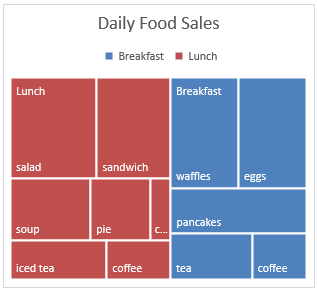
For example, you can make a treemap chart that shows daily food sales, categorized by breakfast and lunch. The food with the biggest rectangle that is on the top is the one that has the most sales.
How to customize it?
If you wish to change the design or customize the chart exactly how you want, then select the chart and on the ribbon, two tabs will appear, “Design” and “Format”.
You can find a couple of designs that you may like. There are a lot of other options which can certainly help you.
If you head right to the “Design” tab, you will find on the left side of the screen a section that is called “Add Chart Element”.
If you click on it, you will have three options where you can choose to add a:
- Chart Title – Here you can obviously set how the chart is going to be named.
- Data Labels – There you can find the “More Data Label Options” option where you can set up in detail how the label is going to look.
- Legend – And the legend, which just adds a legend to one side of the chart.
To further customize your Treemap, you can adjust the hierarchy levels displayed by right-clicking on the chart and selecting Change Series Chart Type.

Leave a Reply