How to create a bell curve in Excel
A bell curve is a symmetrical distribution that is often used to represent the normal distribution of data. We will learn how to create a bell curve in Excel.
Prepare the Data
The first step is to prepare the data that you want to use to create the bell curve. The data should be in a column in an Excel spreadsheet.
Calculate the Distribution, Average, and Standard Deviation
Now we will add the formulas for the distribution, average and standard deviation.
Distribution: =NORM.DIST(A2,$C$2,$D$2,FALSE)
Average: =AVERAGE(A2:A52)
Standard deviation: =STDEV(A2:A52)
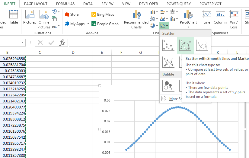
Plot the Scatter Chart
Now let’s plot the scatter chart with smooth lines and markers chart for the same:

The scatter chart show the distribution of the data as a bell curve.

Please find attached the Excel file for reference.
How to Use a Bell Curve
To use a bell curve, you first need to understand the different parts of the curve. The peak of the curve represents the most likely value in the data set. The tails of the curve represent the less likely values.
The standard deviation is a measure of how spread out the data is. The wider the standard deviation, the more spread out the data is. The narrower the standard deviation, the more tightly clustered the data is around the mean.
By understanding the different parts of a bell curve, you can use it to analyze data and make predictions.


Leave a Reply