How to Create a Quarterly Chart in Excel for Sales Data Analysis
In this Excel tutorial article, I show you how to create quarterly charts in Excel.
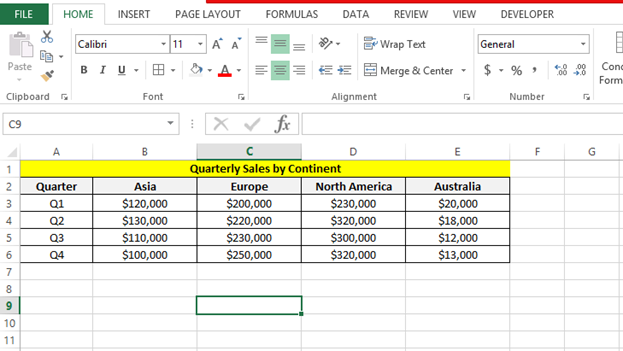
Quarterly sales data preparation
To enter your data into Excel, click on cell to select it. Type in the first label for your data (for example, “Quarter”). Press the tab key and enter the next label (for example, “Sales”). Repeat this process until you have entered all of your labels into the top row of the spreadsheet.
Based on entered data create quarterly sales data chart for a company have centers in 4 continents.

We have to arrange the data similarly to make it look easy to understand and to plot such reporting graph easily.
Creating quarterly chart
Next step is to create a simple sales quarterly graph from the same. For creating a quarterly sales chart visualization, navigate to the Insert menu and choose the Insert column chart option for quarterly data representation as shown below.

To properly format your quarterly sales chart, next you should select the stacked column chart type option for better quarterly data visualization and analysis as shown below.

Next, we can change the look of the chart by switching the rows and columns to group by quarter to make it look better:

Clicking ok will make the graph look like this:

We can make more customizations like adding data labels, as shown below.

We can change the chart title to the quarterly sales by continent, etc. as shown below:

I am attaching the Excel sheet with Quarterly Chart template for you.


aomp
The overall look of your site is fantastic, as well as the content!