How to Make SPC Control Chart
An SPC (Statistical Process Control) control chart is a graphical representation of process data over time, used to detect any potential out-of-control conditions or assignable causes of variation in a process. In this lesson, you will learn how to create a statistical process control chart.
How to create a control chart?
First, we are going to find the mean and standard deviation. To find the mean click on the Formula tab, click on More Function select Statistical and then Average from the dropdown menu. Select cells B2 to B20 and press okay.

Click on the Formula tab, click on More Function select Statistical and then STDEV.S from the dropdown menu. Select cells B2 to B20 and press okay.

Select cell C1 and type “Mean (CL)” in it. Select C2 and type “=I$1”. Move your mouse to the bottom right of the cell until a black plus sign appears. Drag the plus sign all the way to cell C20 to copy the mean.
Select cell D1 and type “UCL” in it. Select D2 and type “=I$1+ (I$2*3)”. Move your mouse to the bottom right of the cell until a black plus sign appears. Drag the plus sign all the way to cell D20 to copy the mean.
Note: UCL= upper control limit typically is 3 standard deviations away from the average which is mean+3 times the standard deviation.
Select cell D1 and type “LCL” in it. Select E2 and type “=I$1+ (I$2*3)”. Move your mouse to the bottom right of the cell until a black plus sign appears. Drag the plus sign all the way to cell E20 to copy the mean.
Note: LCL= lower control limit typically is 3 standard deviations away from the average which is mean-3 times the standard deviation.
SELECT Sample Measures, Mean(CL), LCL and UCL.

Click on Insert tab, click on Line Chart and then Click on Line.

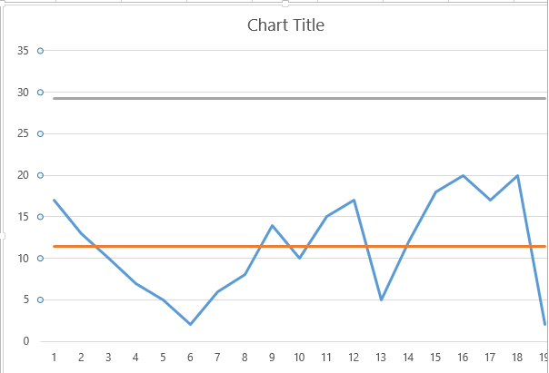
You have created your chart. Resize it. Remove the small black lines by double clicking on them and pressing Delete. That’s it, you’re done.

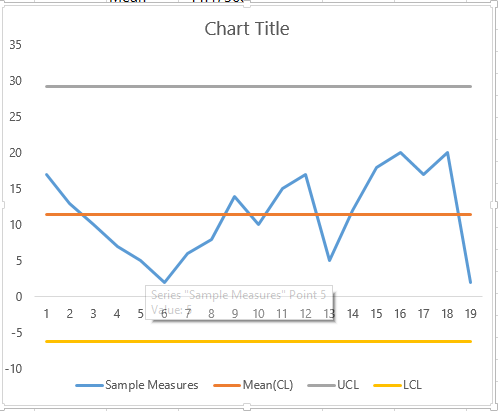
This is what your final chart will look like.

Your Statistical process control chart is ready. The process appears to be in control, as all sample measures fall within the established control limits.
Note that these steps are just a general guideline and that the specific steps and calculations used to create an SPC control chart may vary depending on the type of control chart used and the methodology followed. It’s important to consult a knowledgeable statistician or quality engineer for guidance on creating an SPC control chart for a specific process.
For data that is not normally distributed, consider using alternative control charts, such as those based on medians or individual measurements.


Leave a Reply