How to Make a Slope Graph in Excel
This is the lesson about how to insert Slope Graph in Excel. You, and I are going to create a slope graph chart together, in a simple step-by-step format.
What is Slope Graph
Slope graph shows a comparison of the change in value at two points in time. Slope Graph could be useful for you when you need to show the data which increase (of decrease) in time.
Examples include:
- comparison of the tax rate in all South American countries between 2000 and 2022
- support for the president in the East Coast States on election day and two years later
- sales in the company’s stores before the commencement of the promotional campaign and one month after its completion
- costs in the departments of the company before and after cost cutting.
The purpose of creating a slope chart is to show the change of a given phenomenon over time:
- costs decreased in all departments of the company
- support for presidents is lower two years after the elections than on election day
- the promotional campaign caused the sales to increase in all stores
Slopa graph can also be used to show disproportions or show an existing diagram:
- sales after the promotion fell in all stores in the countryside, but increased in all of the cities
- after cutting costs, you can see a decrease in costs in investment departments, but an increase in production departments
To create a slope chart, you need data in two columns. The number of lines can be much larger.
If you have more than one column, you will simply create a line graph.
Data preparation
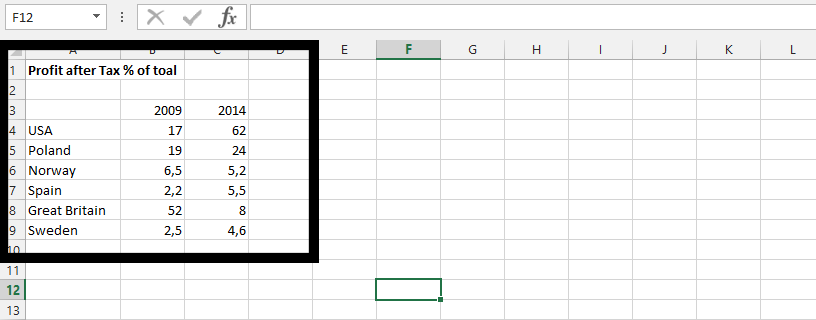
To create Slope Graph in Excel you need to layout your data first.

Select the data.

Inserting Slope Graph
Click insert (1), and click on line chart (2).

Click on Design tab, and Switch Row/Column

On design tab, click on Quick Layout, and choose layout.

Delete the lines.

Slope graph formatting
Click on y axis, and press delete on keyboard. Repeat the step with axis title showing beside the y axis, and chart title.

Right-click on one of the series, and click on format data labels.

Click on label options, chart symbol, label options, and all you need to do is check value.

Note: Show leader Lines is already marked. You should leave it like that.
Double-click on data label that are overlapping or need to be moved to create space for overlapping values, and move it so all labels and value shows.

Click on all the soft edges, and press delete on your keyboard.

Your Slope graph chart will look like this:


Leave a Reply