How to insert Panel Chart in Excel
The panel chart is a set of similar charts that have been aligned neatly in the panel. The chart also has other names like trellis displays or small multiples. Its goal is to help the audience to understand some data that contains different variables.
It makes it a lot easier to structure segment of the document that the author is explaining to the audience.
It is useful to consider choosing the data that is directly relevant to this segment of document, and further develop the data to be as accurate as possible.
The panel chart is not just useful for scientists and technicians, but also to business managers, owners, executives, and even marketing specialists who want to identify the market’s size, and know how to make it a lot easier to comprehend relevant data to the business’ goals.
This is because the panel chart is what make it easier to comprehend the data coming from different categories.
Below is the description on exactly how to create a panel chart that benefits purpose of the creation:
Create Panel Charts in Excel
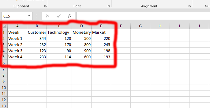
The marked area in red is the place to begin the creation of difference charts. Fill in the information that the panel charts are going to be about.
It is completely your choice to input whatever you wishes to address in the charts. The data inputted was our choice.

You should select the data that is relevant to the chart you would like to create. In the picture above, we have selected the time (week 1 – 4) and the customer segment.

Tips: If you are choosing things that are not beside one another, you should press CTRL, while using the mouse to choose the row. Then you should stop pressing the CTRL button, and use shift + down arrow to choose the whole row(s).
Click on Insert, which is labeled as number 1, and you would be seeing the number 2. In the number 2, you need to choose the kind of charts you would like to create.
Once you click on the “chart symbol” in the number two, you would choose the kind of chart you like.

You would have a chart ready. Click on the “chart title”, as it shows in the marked area, and write the chart’s title.

Tips: Repeat it all the data (cells) that is relevant to the chart.
Adjusting the Axis Format in Excel
Right-click on the right side (the number 1 in the picture shown above), and choose format axis (the number 2).

In the Format Axis panel on the right side of your Excel screen, you’ll find options to set chart borders. Use the box marked as number 1 in red to select the minimum and maximum border values for your panel chart in Excel.
In box number 2, also highlighted in red, pick the units for your axis display.
This is optional, and you could write the numbers if it is needed for your charts.

You decide your inputted data, and you would see what it would look like after you’ve inputted the data.
Charts Alignment
The best way to accomplish the panel chart is making sure that they are aligned in the way that best suit the chart.
Select all the chart that you would like to align.

After you have chosen the charts, you should click on format (the number 1 of the red marked).
The second thing you need to do is in the number 2, you should click on align, and choose the kind of alignment you would like, or if you would like to distribute the charts as it is showing in the number 3 in the picture showing above.
Resize the charts’ sizes to the same.

You should organize the charts the way you would like to have them, and resize them to fit your needs.

You should mark the area, where you would like to have the title. Just as the area above that is marked in red and labeled 1.
In number 2, you would be at the home tab, where you would find the “Merge & Center”, click on it and press on it again, as it shows in the picture above.
In the number 3, you’d get to choose the color you would like the marked area to have.

In the number 1, that is where you should repeat step 3 – 4. But, the area should be marked.


Leave a Reply