Multi Level Pie Chart
Excel can’t create a multi level pie chart where everything is “automatically” taken care of for you, but you have to find a way around to make the solution workable.
For instance, if you have several parts of something, you can demonstrate each item in one pie chart. But sometimes you want to demonstrate the changes in those parts, and the doughnut chart will help you do this.
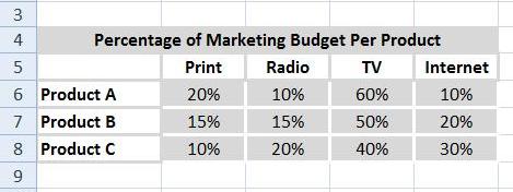
Look at the following table:

You can draw a multilevel pie chart for this data.
To do the same, first of all, create a basic table in Excel as shown below or something similar to it. Then select the data you want to show in the chart, including labels, by dragging the mouse across the cells.

Go to the Insert tab and select from other charts. Select the Doughnut chart.

A circular chart will be displayed. To add clarity, you can further enhance it by right-clicking on each of the doughnuts separately and manually labeling each product category using shapes.
To transform the chart from a regular doughnut chart into a multi-level circular design, adjust the width of the layers. In Excel, the easiest way to do this is by modifying the “Donut Hole Size”.
Click on the chart, and from the menu on the right, select “Format Data Series” and then “Series Options”.
In the “Doughnut Hole Size” box, reduce the percentage significantly. For example, you can set it to 20%.

This change will allow you to create a multi-layer design chart.

It’s essentially composed of not just one, but three separate doughnut charts perfectly aligned on top of each other. Using this same technique, you can create as many layers as needed to represent your data effectively.


Leave a Reply