How to Make a Thermometer Chart in Excel to Track Progress Toward a Goal
In this Excel tutorial, you’ll learn how to create a thermometer-style chart to visualize goal progress using percentages. For this type of graph, you will want to present data that shows the percentage of a value (e.g., the annual plan for sales or budget usage).
A thermometer chart, also known as a “gauge chart” is a type of chart in Microsoft Excel that represents a single value within a range of values, using a thermometer-style visual. The chart can be used to visually track a goal, such as a sales target, and compare it to actual results.
Data preparation
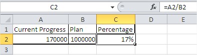
To build a thermometer chart in Excel, prepare two key data points: the current value (actual performance) and the target value (goal).

Select the cell with the percentage.
Creating thermometer chart
Navigate to the Insert tab, choose Column Charts, and insert a Clustered Column chart to begin building your thermometer-style visualization.

Your chart at the moment looks like this:

The thermometer Chart layout
Right-click the vertical (Y) axis and select Format Axis to customize the scale of your Excel thermometer chart.

In Axis Options, set the Maximum value to 1 (or 100%) to reflect full progress in your Excel goal tracker.

Next, right-click the blue bar and choose Format Data Series.

Reduce the bar Gap Width to 0% to give the chart a solid fill, mimicking the look of a mercury thermometer.

Right-click a blank area over a blue bar between the horizontal lines and select Format Plot Area.

Use a solid border color to outline your chart and enhance the visual effect of a thermometer column. Below, select the blue Color.

Your chart now looks like this:

Select the entire chart (click anywhere on the chart). Remove unnecessary chart elements like the legend and gridlines from the Layout tab to streamline your Excel thermometer chart.

Axes > Primary Horizontal Axis > None

Gridlines > Primary Horizontal Gridlines > None

The thermometer Chart is just about to be ready.

It needs to be much more, such as a thermometer. Change the size of the chart.

Resize the chart to be tall and narrow – this makes it visually resemble a classic mercury thermometer.
The effect
To insert the oval on the bottom of the goal chart, go to Ribbon> Insert> Illustrations > Shapes. Choose the Oval and adjust it to the chart.

Your thermometer chart is now complete.

You can use this chart to visually track the progress towards a goal and compare it to the actual result. You can also change the goal and actual result values in the worksheet, and the chart will update automatically.
You can also add other elements to the chart, such as trendlines or error bars, to make it more informative.


Leave a Reply