How to Create a Gantt Chart in Excel
In this lesson, you will learn how to create a Gantt chart.
Table of Contents
What is a Gantt Chart
A Gantt Chart is used in project management. As the project is divided into individual tasks, the Gantt chart shows the distribution of tasks (mini-projects) in time. Share the main design of the mini-projects and create a Gantt chart to see where in time they are.
How to Make a Gantt Chart
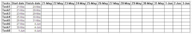
Prepare a data table first.

Enter logical functions in cell E3. The function will look like this: =ANDE$2>=$C3;E$2<=$D3)

Approve and drag on any cell in the table. Excel shows, what is the logical answer based on function.

Conditional Formatting
You do not depend on the responses of TRUE or FALSE only to illustrate the distribution of tasks over time. So take advantage of conditional formatting. Copy the formula, select the cells that contain a function, and create a new conditional formatting rule.

The formula will be used for cells that reformat, so choose the last option on the list. Paste the formula and select the packed red cell formatting. Approve and delete the logical response by pressing the Delete. The Gantt diagram is ready.

With a Gantt diagram, you can also create a bar chart. In the data table, you will still need the duration of the project. Insert a column and calculate the duration of the project.

Create a Stacked Bar Chart
Insert a Stacked Bar Chart. Create a chart without any data because it will be easier this way.

Right-click on the chart and choose Select data. You now add data series. The first series of data is the date of the commencement of the project. The name of the series Start date, and the value of a particular start date for projects is unknown.

The second series of data is the duration of the project. Here, by analogy, the name will be Duration (days), and the values of various quantities in this column.

Format the Gantt Chart
You must still determine the labels for the chart. Among them are the names of the projects.

You created a preliminary version of the Gantt chart. It requires many more changes. Start by removing the legend button Delete.

Still interfere with the blue bars. Click the right mouse button and choose Format Data Series. Remove the fill color of the line by choosing No fill.

Take care now to reverse the order of categories (i.e., names of the projects). Right-click and choose Format Axis. Select Categories in reverse order and confirm.

Still, the date range doesn’t match on the axis. Click the right mouse button and select Format Axis.
Remember that Excel reads the date as a number. In this case, the axis begins about 9 days too early and finishes 2 days too late. So, not going into unnecessary calculations.

The stacked bar Gantt chart is ready.


Leave a Reply