How to Insert a Filled Map Chart in Excel: Complete Tutorial Guide
Excel 2016 came with a lot of new features, one of those was a large number of charts that were implemented after several years of no new ones.
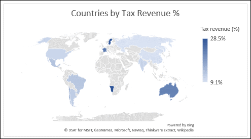
What is a Filled Map?
A filled map chart is used to visualize selected data within a geographical blank map. It is useful when you want to display certain statistics by region.
Follow this guide on how to create and customize a Filled Map chart in Excel with these simple steps.

How to create a Filled Map?
To make a filled map chart, the first thing you have to do is have a set of data ready. This works if, for example, the sales are divided by cities, countries, or other types of regions. Then you will want to convert that set of data to geography.
Here’s how to insert a Filled Map chart in Excel step-by-step:
- Select the data that you want to be displayed
- Find the “Data” tab that is located on the ribbon
- When you click on it, you will want to head to the “Data Types” section
- And then select “Geography”, and everything will be converted
After that, icons that resemble maps will appear next to the regions that you converted, and they will be automatically connected with the bing maps.
Once you’ve done that, a map will be formed, where all your data will be visually displayed by countries.
How to format a Filled Map?
If you want to manage your chart’s settings, you will need to select it first. Then you will find two tabs on the ribbon, “Chart Design” and “Format”.
Click on the chart and you will get a “Format Plot Area” pane where you can choose how to fill a certain region.
Also, you can double-click the chart so the “Format Object Task Pane” will appear. There will be a number of series options which you can adjust.
Map projections – You can change how the map is going to be projected.
Map area – You can change how much the map is going to be zoomed in, from a single state/province to the entire world view.
Map labels – You can manage how the labels fit. You can, for example, make geographical names visible.
If you head right to the “Design” tab, you will find on the left side of the screen a section that is called “Add Chart Element”, or you can just click the plus sign that appears when you click on the chart.
If you do it, you will have three options where you can choose to add a:
Chart Title – Here you can obviously set how the chart is going to be named.
Data Labels – There you can find the “More Data Label Options” option where you can set up in detail how the label is going to look.
Legend – And the legend, which just adds a legend to one side of the chart.

As you may notice, this feature provides an excellent way to analyze and display regional data trends in Excel.


Leave a Reply