The Ultimate Guide to Pivot Tables in Excel
In this lesson, you will learn how to use Pivot Table in Excel.
How to insert the Pivot Table?
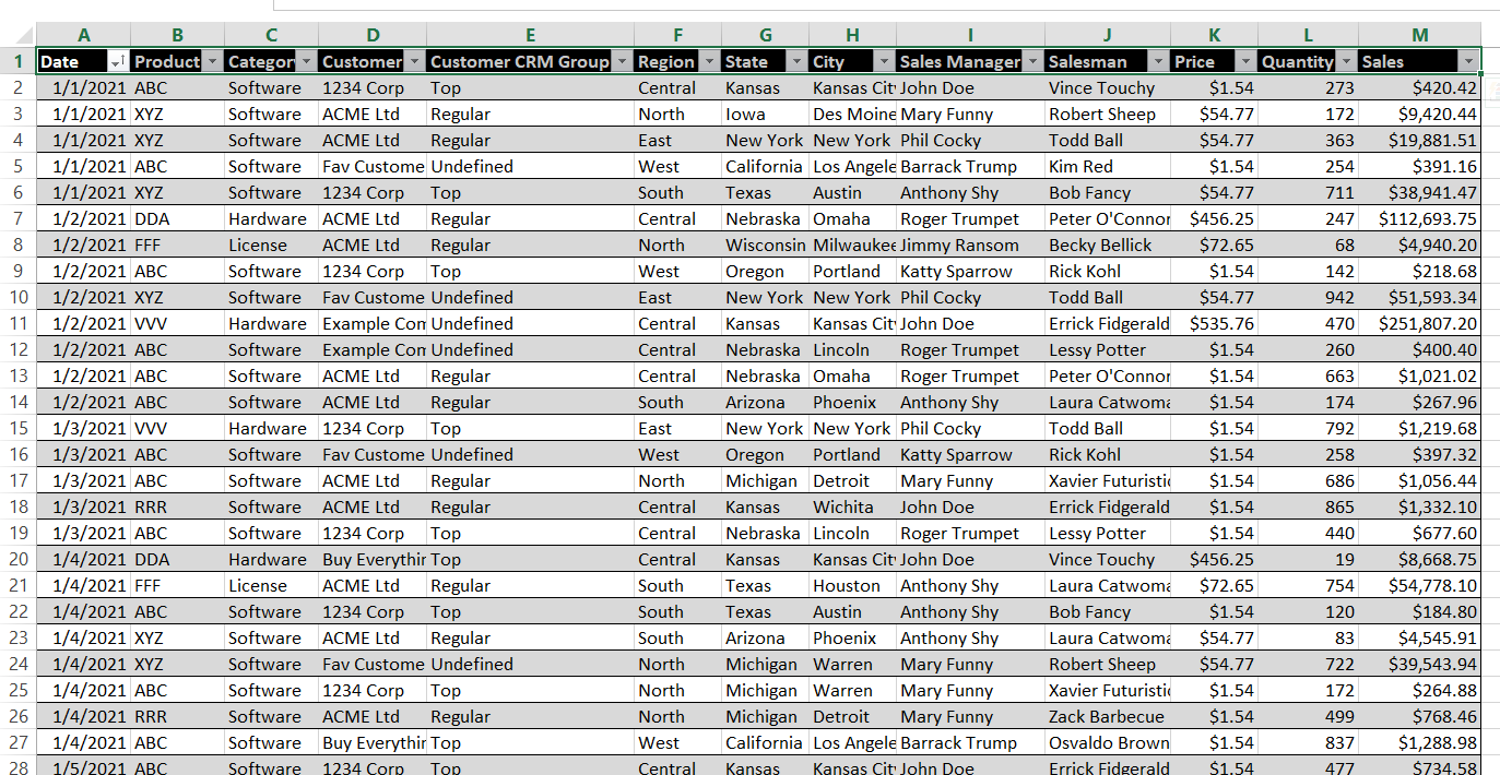
I have prepared sample sales data for an imaginary company.

The table contains columns such as:
- Date
- Product
- Category
- Customer
- CRM Customer Group
- Region
- State
- City
- Sales Manager
- Sales Rep
- Price
- Quantity
- Sales
To insert a pivot table, go to the Insert tab and click the Pivot Table button. You can also use the keyboard shortcut ALT + N + V.

To create a pivot table, select the range of cells you want to analyze. Excel will automatically identify the correct range in most cases. Click OK to create the empty pivot table on a new worksheet.

Populate Pivot Table With Data
To populate a pivot table with data, drag and drop the column labels into the four areas on the right side of the screen. You can experiment with different combinations to see how the pivot table changes.
Here are the four Pivot Table areas in Excel:
- Rows
- Columns
- Values
- Filters
Tips for Becoming a Pivot Table Power User
Pivot tables let you create many variations from the same data set. You are only limited by your imagination. As you experiment with pivot tables, you’ll quickly become more familiar with their different areas and applications. Each new table setup helps you discover new ways to display your information. Because of this flexibility, pivot tables are essential for data analysis.

Understanding Pivot Table Areas
Here are some essential rules to keep in mind when building a pivot table:
- Filters: Apply filters to narrow down data by criteria like region, date, or customer.
- Rows: Organize data by dragging a column here. For instance, if you add “Region”, your pivot table will break down sales for each area.
- Columns: Compare values across categories by placing a column here. For example, dragging “Product” lets you view sales by item.
- Values: Use this section for calculations such as total or average sales. The results summarize your data.
As you explore pivot tables further, you’ll gain comfort with each area and its features. Creating new reports unlocks additional options for displaying information. Over time, your data analysis skills will grow more powerful with each table you design.
Next, let’s look at an example: I created a basic report that shows sales products for customers.

Excel calculated many useful numbers in the pivot table. You can see the sales of each product for each customer. The pivot table also shows the total sales for each row and column.
Adding more categories of products to the pivot table will make it more detailed, but it may also make it more difficult to read.

Let’s create better Pivot Table reports in Excel.
Formatting Pivot Table
Right-click on the data values and choose “Number Format” to format your pivot table.

I’ll choose the Currency format to show the values as sales revenues. I’ll reduce the decimal places to 0 to save space.

Number formatting makes the report easier to read.

Sort Pivot Table
To improve visibility even further, sort the pivot table by clicking on the bottom row and selecting “Sort Largest to Smallest”.

Sort the data in the last column in descending order.

This is how the report looks now.

The pivot table is now easier to read because the sales are sorted in descending order. This makes it easier to see the top-performing products and regions.
You can also sort the pivot table by other criteria, such as date or customer.
Keeping your pivot table in a logical order makes it look more professional and helps you to communicate your findings more effectively.
Pivot table filtering
A pivot table can be a very complex report, so you may need to filter the data. To do this, you can add filters to the pivot table.
In this example, I added filters for Region, State, and City.

The filter appears at the top of the pivot table. I filtered the data to show only sales from the Central region in Kansas.

The pivot table shows only sales from the Central region in Kansas. The data is sorted in descending order.
Slicer
Another way to filter a pivot table is to use a slicer.
A slicer is a tool that allows you to quickly filter the data in a pivot table by one or more fields.
To insert a slicer, click on a cell in the pivot table and then go to the Analyze tab.

You will see a window with the options for inserting slicers.

Choose any product you want. I will click on “Product” to see the list of products.

The slicer shows me some useful information even before I select anything. I can see that one product is grayed out, which means that there is no data for that product. I can select a product to see the filtered data quickly.
I can click on each product in the slicer to see how the pivot table data changes. The slicer filters the table very quickly.
To select more than one product, hold down the Ctrl key and click on the other products.

You can add more slicers to filter the data even further. To do this, click on a cell in the pivot table and then use the Insert Slicer button again.
I added another slicer to filter by customer.

My data is filtered the way I want it. If you don’t like the slicer, you can remove it by right-clicking it and selecting “Remove”.

You can also keep the slicer and remove its filter. To do this, click the Clear Filter button in the slicer.
Updating (refreshing pivot table)
Pivot tables do not automatically update when the source data changes. To update a pivot table, right-click it and select “Refresh”.

Updating the data in a pivot table takes just a second. The formatting will remain the same.
Advanced Applications: Scale Your Excel Impact
You’ve mastered this advanced technique. Now it’s time to integrate it into professional workflows, build automated systems, and apply these skills to strategic business challenges. Our specialized learning hubs show how top professionals combine multiple techniques to create enterprise-grade solutions.
🚀 Scale Your Expertise:
- Excel Business Intelligence & KPI Dashboards – Combine multiple advanced techniques into interactive dashboards. Learn how enterprises track performance across entire organizations.
- Excel Data Analysis & Statistics – Apply advanced Excel alongside statistical rigor. Build predictive models, forecasts, and data-driven decision systems.
- Excel for Financial Analysis & Investment Strategy – Use these techniques for sophisticated financial modeling, valuation analysis, and portfolio optimization.
These hubs are designed for professionals ready to take their Excel skills to enterprise level. Explore the hub that matches your industry and unlock the full potential of Excel-based analysis and automation.


Leave a Reply