How to open XML files in Excel?
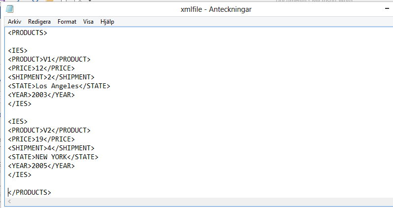
Using XML file on Excel, and working further on it is quite simple. We are going to use Microsoft Excel to use XML, but first you need an XML file.
Excel Skills Simplified: Tutorials That Actually Work
Using XML file on Excel, and working further on it is quite simple. We are going to use Microsoft Excel to use XML, but first you need an XML file.
A bump chart is a type of chart that can be created in Excel. We are going to insert a ranking bump chart.
Learn how to add a custom menu in Excel and customize your Quick Access Toolbar. The Quick Access Toolbar (located at the very top of the Excel window) allows you to add custom menu items and create a personalized collection of frequently used commands. This customization provides quick access to your most-used features without navigating through the Ribbon, making your work more efficient.
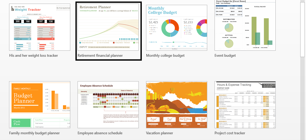
Using a template is about choosing the one that perfectly suit the purpose. If you for instance want to do event planning, pick the template that is for event planning. You will learn how to use a template.
A butterfly chart, which is also known as a tornado chart, is a type of chart used to visualize the changes in the difference between two variables over time. To create a butterfly chart in Excel, you’ll use a stacked bar chart format. It is called a butterfly chart because it resembles the shape of a butterfly, with two “wings” representing the changes in the two variables. This chart is particularly useful for visualizing and comparing changes in the spread between two data sets.
Standard deviation is a commonly used statistic in finance and economics to measure the volatility or risk of a security or portfolio. By plotting the standard deviation over time, you can create a volatility chart that shows how the volatility of a security or portfolio has changed over time. This type of chart is known as a standard deviation volatility chart.
Creating a standard deviation volatility chart in Excel is about understanding how a security’s volatility or price fluctuations have changed over a specific period of time.
In this Excel tutorial, you will learn how to craft a timeline chart – a powerful tool for representing events or milestones along a timescale. Here’s a step-by-step guide on how to create a timeline chart in Excel:
You are going to learn how to insert a surface chart, and it will be easy to perform.
This Excel tutorial guides you through the process of inserting and formatting a Radar Chart, also known as a Spider Chart or Web Chart.