Best Excel Tutorial

Excel Skills Simplified: Tutorials That Actually Work

moving average data tables

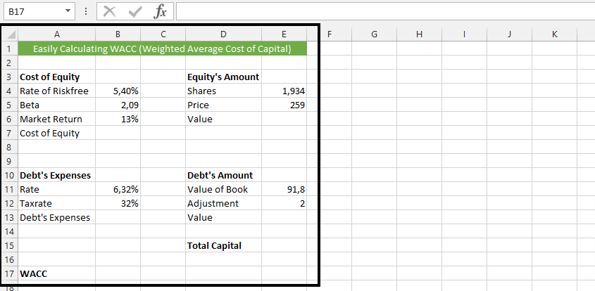
How to Calculate Yield to Maturity in Excel

Yield to maturity (YTM) is the total return expected from a bond if the investor holds it until maturity, taking into account the current market price, coupon payments, and the face value of the bond.

YTM is academically defined as market interest rate, but means Yield to Maturity. It actually takes purchase price, the value of redemption, time between payment of interest, and the yield of coupon.

Read More

moving average data tables

How to Calculate Production Efficiency in Excel

Production efficiency is a measure of how effectively a company uses its resources to produce goods or services. It can be calculated in a number of ways, but one common method is to use Excel.

In this article, we will show you how to calculate production efficiency in Excel. We will also provide you with a free template that you can use to calculate production efficiency for your own business.

Read More

table data set to calculate the moving average

How to Calculate Rolling Average in Excel

A rolling average is a type of moving average that calculates the average of a set of data points over a specified period. The period can be fixed or variable, and it is typically used to smooth out fluctuations in the data. This technique is particularly valuable in data analysis as it helps identify trends and patterns by reducing noise in datasets. Understanding how to calculate a rolling average in Excel is essential for anyone working with time-series data or analyzing financial trends.

Read More

Excel insert pictures ribbon

How to Add Custom Menu?

Learn how to add a custom menu in Excel and customize your Quick Access Toolbar. The Quick Access Toolbar (located at the very top of the Excel window) allows you to add custom menu items and create a personalized collection of frequently used commands. This customization provides quick access to your most-used features without navigating through the Ribbon, making your work more efficient.

Read More

Correlation data

How to Make Butterfly Chart

A butterfly chart, which is also known as a tornado chart, is a type of chart used to visualize the changes in the difference between two variables over time. It is called a butterfly chart because it resembles the shape of a butterfly, with two “wings” representing the changes in the two variables. This chart is particularly useful for visualizing and comparing changes in the spread between two data sets.

Read More