How to create a chart with a baseline?
In this Excel charting tutorial, you will learn how to create a chart with baseline. You may need that for reports or checking filling the targets (eg. targets of production or sales).
When to use chart with a baseline?
You may need to use a chart with a baseline to visualize fulfilling the goals, reaching the targets, or showing the sales results.
How to create a chart with a baseline
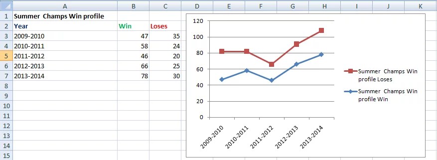
1. To create a chart with a baseline, you’ll need two sets of data: one for the actual values and one for the baseline. The actual values will be plotted as columns or lines in the chart, while the baseline will be represented as a horizontal line. Consider the data and plot the line chart from it.
To create a chart, select your data and then click on the “Insert” tab in the ribbon. From there, choose the type of chart you want to create, such as a line chart.

2. In the first row, enter the baseline value and drag it downward as shown below.

3. Open the chart window and, under the design tab, select the Select Data option.

4. A window will appear like the one shown below. Click on the Add option.

5. On selecting Add option, a small window will appear. Set the Series name as Baseline and for Series values select the whole column of Baseline from the data. Then press OK.

6. Now you will have a baseline in your chart window as shown below.

After you’ve added the baseline and formatted it, you can finalize your chart by adding a title, axis labels, and other formatting as needed.


Leave a Reply