How to Break Y Axis in Excel
In this Excel charting tutorial, you will learn how to break Y axis in chart. It is useful in the case of problems with the axis scale. When your data is really differential, just use this trick.
Prepare data for broken axis data
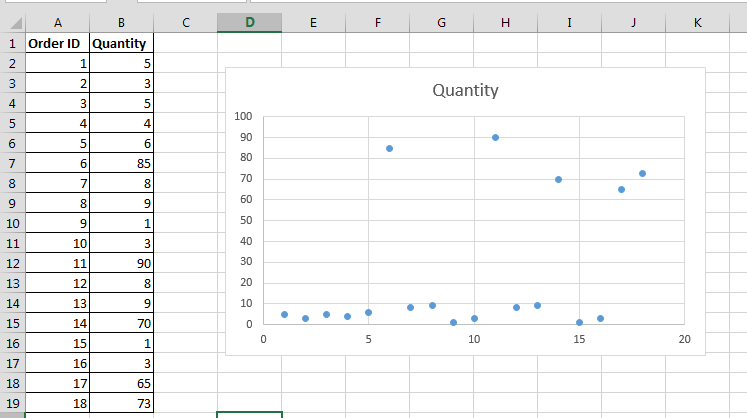
1. After entering data into an Excel sheet, select the data and form the desired chart through Insert > Charts.

2. Delete the grid lines through format grid lines options, select line and fill to no fill and no line through axis options. Also, delete the legends.

3. Now, right-click the vertical axis and go to format axis. In the format axis, enter minimum to 0 and in maximum enter the point after which you want to create the break in the graph.

Add a Break in Excel chart
4. Resize the chart by dragging down the inner handles.

5. Now make a duplicate copy of the chart. Select the chart and press ctrl +D to make a duplicate copy. Remove the borders of the chart by selecting no line under no border options. In format axis option, change the minimum to the point where you want to resume your chart after the break. Your chart will look like this:

6. Place this new chart over the old chart:

Also, insert the marker (through Insert >Shapes) to show a break between the data.
7. In the final step, add labels, legends and axis titles.

8. Adjusting the Gap: In your chart with the broken Y-axis, you can adjust the size of the gap between the two sections of the Y-axis to control how much of a break is shown. Simply click on the gap between the two sections and drag it up or down to increase or decrease the size of the gap. This allows you to fine-tune the chart’s appearance based on your preferences.
9. Adding a Label or Marker: To make it clear that there is a break in the Y-axis, you can add a label or marker. You can use a text box or a shape (e.g., a line or arrow) to indicate the break visually. This label or marker can include a brief explanation or note to inform viewers about the break and the reason for it.
10. Legends and Axis Titles: Ensure that your chart has clear legends and axis titles. This helps viewers understand the data and context, even with a broken Y-axis. Clearly label the Y-axis sections before and after the break to avoid confusion.
11. In some cases, breaking the Y-axis may not be the best solution. Consider alternative chart types, such as a dual-axis chart or a stacked column chart, that can present the data without the need for a break.


Leave a Reply