How to Create Interactive Dashboard in Excel
Creating an interactive dashboard in Excel can help you communicate complex data insights in a visually appealing and accessible way. An interactive dashboard allows you to present data from multiple sources, including charts, tables, and pivot tables, and provides users with a way to interact with the data to gain insights and make informed decisions. Follow this steps below to create an interactive dashboard.
Start by defining your goals and objectives for the dashboard, including the type of data you want to display and the audience you want to target. This will help you determine the best way to organize and present the data.
Table of Contents
Background
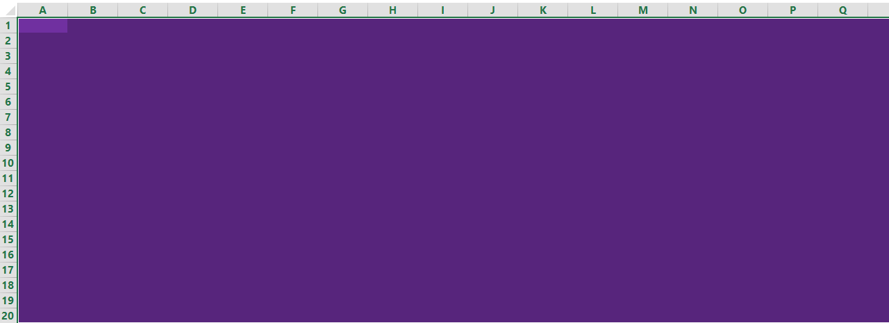
First you have to create a background. Do this by selecting many cells and changing the background color. In this case we have hanged the background color to violet.

Visual elements
After creating the background you will use the data within the other spreadsheets to create the visual elements for the dashboard.
The chart type you choose depends on the type of data you are working with and what you want to communicate. Some of the most common chart types used in interactive dashboards include bar charts, line charts, pie charts, and scatter plots. Use the chart and table tools in Excel to create the charts and tables that will be included in your dashboard.
Once you have created each visual element, copy and paste the charts, graphs, and tables from the other spreadsheet to your dashboard.

Interactive buttons
Now you have to create interactive buttons. Interactive buttons will allow users to “drill down” to see more details about the information displayed on the dashboard. By adding buttons onto the dashboard, any user that would like to visit a specific spreadsheet containing raw data. To create a “button” add a rectangle shape to the dashboard, apply bevel effects and change any other formatting, if desired. Add text to the shape that describes where the button will take the user, when clicked.

Now you need to hyperlink the rectangle button to the appropriate sheet. Right-click on the rectangle button, then click on the Insert tab, and then click on Hyperlink. A dialog box will appear. Click on Place in This Document and select the appropriate spreadsheet linked to your graph. (In this case we select Bar chart for the button movies).

Click on the rectangle buttons to go to the other spreadsheet containing raw data of your graph, charts etc. That’s it, you have now created an interactive dashboard in Excel. You can further customize your dashboard to your liking.

Consider adding summary data or KPIs to your dashboard to provide a quick overview of key metrics. This could include metrics such as total sales, average order value, or customer satisfaction.
Test your dashboard by using it yourself and asking others to provide feedback. Make any necessary changes based on their feedback to refine the dashboard and make it as useful as possible.
Here you can download Interactive Dashboard template.
Creating an interactive dashboard in Excel can be a powerful way to communicate data insights and help others make informed decisions.


Leave a Reply