How to Create a Polar Chart in Excel: Step-by-Step Guide
Creating a polar chart in Excel can be a great way to visualize cyclical data, like percentages over time. In this comprehensive Excel tutorial on polar chart creation, you will learn step-by-step how to make and design a polar chart.
Layout and Design of Your Data
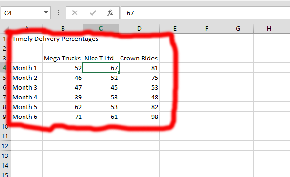
Lay out your data as shown in the example. Ensure the data aligns with your objective.

Enter the title (e.g., “Timely Delivery Percentages”). Adjust column widths by clicking on the column headers (A, B, C, etc.) and dragging the column dividers.
Then, you should go to the Merge & Center that is found on the Home tab of Microsoft Excel. Click on it, and click on the Merge & Center that shows once you click on the one marked number 2.

After you’ve completed the previous step, you can now mark the title and select the merged column. You should click on it (it is marked as number 1 in the pic), and then click on the Cell Styles (marked as number 2 in the pic), and choose the color in the one labeled as number 3.
In this case, accent 5 was chosen for the title. Select the cells containing the month names and the title cell. Click on the first month name, hold down the Shift key, and click on the last month name. Then, while still holding Shift, hold down the Ctrl key and click on the title cell. Apply a cell style or formatting.
Do the same for the value data cells. Choose a different cell style or formatting. Your data should now resemble the example.

Polar Chart Creation
Select your data (1), then navigate to the Insert tab (2) and click Recommended Charts (3). Next, choose All Charts (4).
Once you see number 4, you should choose the Radar (number 5), and finally choose the kind of chart you would like, which is number 6, and finally choose the one you would like to have, and click on Ok.

You could just use the one marked in red and labeled as Alt in the picture above to create the polar chart.
Click on the title chart and type in the title of the chart you have created.

You now have your polar chart ready.
Polar charts are most effective for polar chart data visualization with cyclical or radial nature, such as wind direction, periodic measurements, or data related to compass points. They are generally not suitable for comparing discrete categories or showing trends over time, for which other chart types like bar charts or line charts are more appropriate.


Leave a Reply