How to add horizontal line to chart?
In this Excel charting tutorial, you will learn how to add a horizontal line to a graph. Inserting a horizontal line into a chart is very possible.
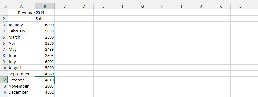
Chart preparation
But, first we need a chart that looks like this:

Add a new label to the data, then in the cell below, type =AVERAGE(range of your data values).

Note: This step is just a possible way to inform Excel what information to use for the line. You should repeat this step on all the remaining cells to match the rows of the remaining columns.
Horizontal line adding
Right-click on any of the series, and choose select data.

Click add

Choose the cell for series’ name, and cells for the values.

Right-click on any of the average series (1), and choose change chart (2).

On the chart type, change the chart to line.

The final result would look something like this:

Horizontal line formatting
The next step is to add a description of the horizontal line. Go to the Ribbon and add data labels.
Click on your horizontal line and select Ribbon > Design > Add Chart Element > Data Labels> Center.
Data labels will appear. Delete all with the Delete key except one. Enter a description of the horizontal line and format the font.

This is how to add a horizontal line to a chart.


Gulbraa
This blog provides a superior resource for anyone curious in learning more about related subjects.