How to create a Sunburst Chart in Excel
A sunburst chart is a hierarchical chart that uses concentric circles to represent data. It is a great way to visualize large amounts of data and show relationships within a hierarchy.
In this article, we will show you how to create a sunburst chart in Excel. We will also discuss the benefits of using a sunburst chart and how to customize it.
Table of Contents
What is a Sunburst Chart?
A sunburst chart, or diagram, is a chart that is used for visually depicting hierarchical data that consists of concentric circles. The hierarchy moves outwards from the center.
The circle that is closest to the center of the chart shows the top of hierarchy data, while the one that is furthest from it represents the bottom of the hierarchy data. Also, concentric circles can be painted different colors, so the chart is customizable.

How to Create a Sunburst Chart in Excel
To create a sunburst chart in Excel, you will need to have the following data:
- A table with the data that you want to visualize. The table should have one column for each level of the hierarchy.
- The data in the table should be sorted by the hierarchy.
Once you have the data, you can create the sunburst chart by following these steps:
- Select all the data within the table and go to the “Insert” tab that is on the ribbon.
- Then go to “Insert Hierarchy Chart” and select the Sunburst chart.

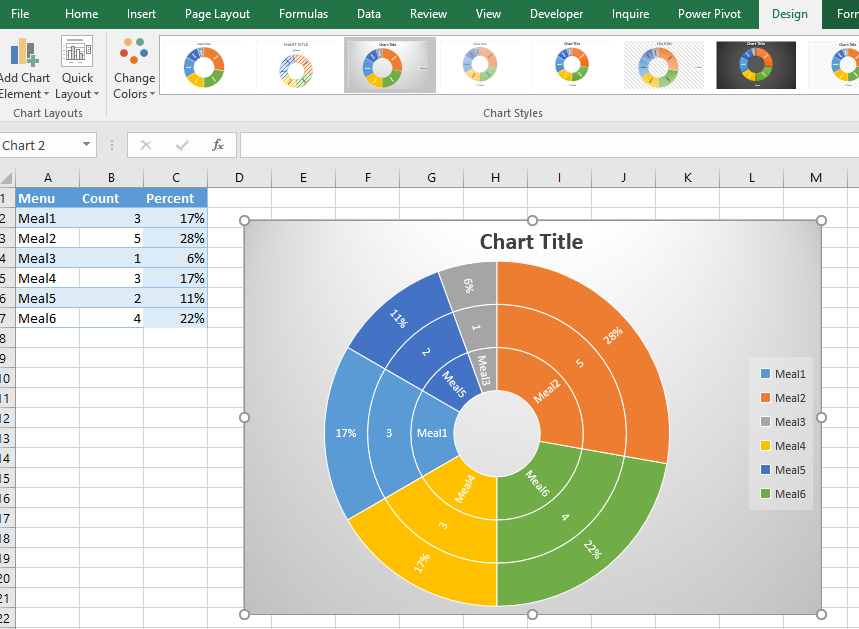
Inner rings show broader categories. Outer rings show more specific subcategories. Bigger slices mean bigger values.
The sunburst chart will be created and inserted into your spreadsheet.
How to customize it?
If you want to customize or change something, then select the chart and on the ribbon two tabs will appear, “Design” and “Format”.
There you have a number of options which you can play with, adjust, and make it exactly how you want it to be. There are a number of different designs from which you can choose.
If you head right to the “Design” tab, you will find on the left side of the screen a section that is called “Add Chart Element”.
If you click on it, you will have three options where you can choose to add a:
Chart Title – Here you can obviously set how the chart is going to be named.
Data Labels – There you can find the “More Data Label Options” option where you can set up in detail how the label is going to look.
Legend – And the legend, which just adds a legend to one side of the chart.


Leave a Reply