How to graph a sine wave?
In this Excel charting tutorial, you can learn how to graph a sine wave.
The sine wave is usually the first function that students learn as they study trigonometry.
Thanks to the sine wave, you can show physical phenomena such as sound waves and it has applications in acoustics. A sine wave is considered to be the purest sound at a given frequency acoustically.
The sine wave in music plays a very important role. It is the starting point for Fourier analysis because it consists of presenting periodic functions as the sum of sine waves of different frequencies and phases.
Preparation of sine wave data
To create such sine wave chart first what you need is to prepare data.
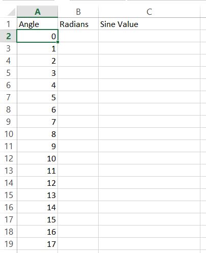
Generate data for the sine wave. Start from writing angles from 0 to 360 degrees.

Next, you need to convert degrees to radians. To do that just use =RADIANS(A2) and drag down.

Next thing you need to do is convert radians to sine value.
Here’s the formula for you. Use Excel SIN fuction.
Sin formula will be =SIN(B2). Drag it down again.
How to plot since wave graph?
Base on sine values you will be able to insert sine wave plot.

Base on sine values create line chart.
Format the chart. To make the chart more readable, you may want to add gridlines, axis labels, and a title.

You can also adjust the scale of the vertical axis to ensure that the sine wave fits within the chart area.


Leave a Reply