How to Create Pie of Pie Chart in Excel
In this article, we will try to learn how to create the Pie of the Pie chart.
What is a pie of pie chart?
A Pie Chart is also known as a circle chart, where data is represented in slices that resemble pieces of a pie.
But we have a limitation in pie charts, unlike other charts like column and line chart we can only use single data series in a pie chart.
Also we cannot display any negative value of a zero value in a pie chart which is another limitation. Any negative value if used will be displayed as it positive part.
Moreover we have to choose the categories in such a way that the total of categories should we displayed as a percentage of 100. As complete circle denotes 100%.
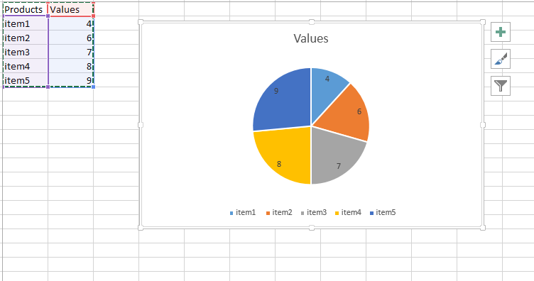
It will look good if we can display less than 10 categories, otherwise it will become not readable in the pie chart. Let us start by creating data for a simple pie chart and creating a simple pie chart based on that. You need a set of data that contains at least two columns: one column for the categories and one column for the values.

Inserting a pie of pie chart
Now add more details of some category by selecting pie of pie chart which is as shown below:

The final chart will represent item4 and item 5 as a separate pie out of the bigger pie like this:

Now we got the pie of pie chart.
You can customize the look and feel of the chart by changing the colors, fonts, and other chart elements. You can also add data labels, legends, and other elements to provide more context and information.
Once you have created the Pie of Pie chart, you can use it to analyze and compare the values in your data. The main pie chart will show the larger slices of data, while the separate pie chart will show the smaller slices, allowing you to see the distribution of values in more detail.


Leave a Reply