How to Create a Waterfall Chart in Excel
In this tutorial, you’ll learn how to create a waterfall chart in Excel step-by-step.
Table of Contents
What is a waterfall chart?
A waterfall chart in Excel is a powerful tool used to visualize how positive and negative values impact a final result, such as net profit or cash flow.
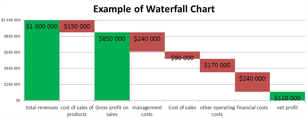
Creating a waterfall chart in Excel is a straightforward and effective process. You can use a waterfall chart in Excel to display revenue and expenses for a business, project, or personal budget. A more ambitious application is to illustrate a profit and loss statement for a business. A waterfall chart makes it easier to visualize your income and spending in a monthly budget format. You have more difficult examples. The waterfall chart will show the individual components of the profit and loss (simplified). Subsequently, we consider:
- total revenues,
- cost of sales of products,
- Gross profit on sales,
- management costs,
- Cost of sales,
- other operating costs,
- financial costs,
- net profit.
How to Insert a Waterfall Chart in Excel?
Start with your data. Create a table with sample values for revenue, expenses, and net profit – formatted similarly to a basic accounting spreadsheet.

In the second column, enter the calculated residual profit. It is through the remainder of the profit rise, ‘waterfall’ on the chart. For example, the remaining profit for the financial cost is the sum of the financial cost and the cells below, or net profit.

Insert a stacked column chart in Excel based on your data. You can remove the legend to keep the chart clean.

Currently, the chart doesn’t resemble a waterfall chart. To change this, click on one of the blue columns (Excel ticks all) and format the column. A dialog box appears, where you should select ‘No fill’.

To complete the waterfall chart appearance, set the ‘Gap Width’ under Series Options to 0% (No Gap).

For an even more attractive graph, format the column with the revenue and profits by setting the fill color to green.

Once you format your columns and add data labels, your Excel waterfall chart will be ready. You may also want to customize the axis scale for clarity.

Your Excel waterfall chart is now complete and it stands out from typical bar or line charts. In the same way, the waterfall chart can be used to illustrate your monthly budget.


kecyExege
Tons of Excel stuff I like