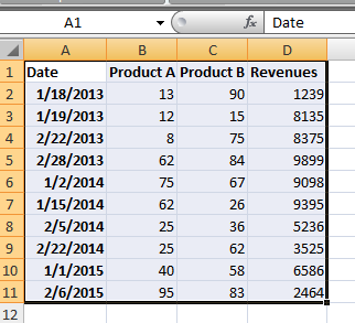
How to Show Year over Year Growth
In this Excel charting tutorial lesson, you will create a year-over-year report using a pivot table. You may need that for reports in Excel. Analysts will be especially happy because of that lesson.
Excel Skills Simplified: Tutorials That Actually Work
In this Excel charting tutorial lesson, you will create a year-over-year report using a pivot table. You may need that for reports in Excel. Analysts will be especially happy because of that lesson.
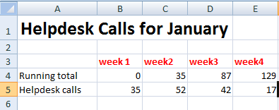
In this Excel charting tutorial lesson, you will learn how to insert a chart with a scrollbar in Excel application. This kind of chart could be useful for more complicated data sets.
This is quite an interesting kind of chart in this Excel tutorial. Here you learn how to create floating bars and put them into your chart.
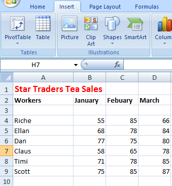
Learn how to create a chart with grouped data in Excel. This comprehensive tutorial teaches you how to group data in your chart and organize information for consolidated reports and data visualization. Master the techniques to group chart data, organize complex datasets, and create professional charts for better analysis and presentation.
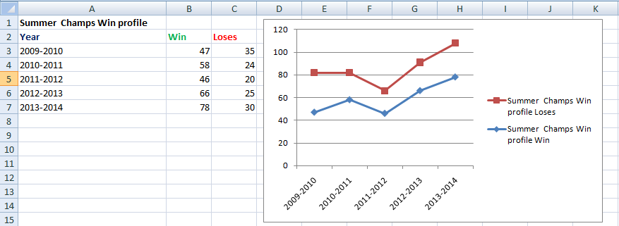
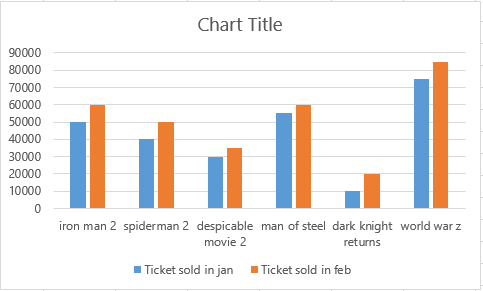
In this Excel charting tutorial, you will learn how to create a chart with baseline. You may need that for reports or checking filling the targets (eg. targets of production or sales).
Learn how to change markers on Excel graphs with this comprehensive step-by-step tutorial. Discover how to customize marker colors, shapes, and styles to highlight specific data points and enhance your chart presentation. This guide covers all methods to change Excel markers, from basic color modifications to advanced formatting techniques.