Best Excel Tutorial

The largest Excel knowledge base ✅ The best place to learn Excel online ❤️

moving average data tables

How to make a Scatter Plot

A scatter plot can be used to show the correlation between two different variables X and Y. By using the points in the plot, the recipient can easily infer how these variables relate to each other.

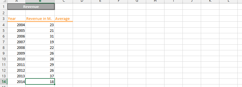
For example, a scatter plot can show the relationship between a company’s revenue and net profit.

To insert a Scatter Plot in Excel, follow these steps.

Read More

moving average data tables

How to Calculate Yield to Maturity in Excel

Yield to maturity (YTM) is the total return expected from a bond if the investor holds it until maturity, taking into account the current market price, coupon payments, and the face value of the bond.

YTM is academically defined as market interest rate, but means Yield to Maturity. It actually takes purchase price, the value of redemption, time between payment of interest, and the yield of coupon.

Read More

moving average data tables

How to Calculate Production Efficiency in Excel

Production efficiency is a measure of how effectively a company uses its resources to produce goods or services. It can be calculated in a number of ways, but one common method is to use Excel.

In this article, we will show you how to calculate production efficiency in Excel. We will also provide you with a free template that you can use to calculate production efficiency for your own business.

Read More