Chart with average line
In Microsoft Excel, you can add an average line to a chart to show the average value for the data in your chart. In this Excel tutorial, you will learn how to create a chart with an average line.
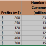
First, prepare some data tables.

Preparing an average line for a graph
First, calculate the average by selecting a cell outside your data range (e.g., beside your data table). Use the Excel AVERAGE function for calculations. Enter =AVERAGE(B2:B24) in the formula bar and press Enter. This cell will now display the average of the data in the range B2 to B24.

In my example formula is =AVERAGE([Sales]) or =AVERAGE($B$2:$B$24). On best-excel-tutorial.com, you can learn more about Define Name.
Select all the data, and create the chart by clicking on insert tab. I recommend Column Chart or Line Chart.

Right-click on the average column. From the list, choose the Change Series Chart Type option.

Inserting average chart
Choose a Line Chart.

Adding an average line in chart
The average line chart is ready.

This is it. Average line on the chart could be useful to compare data with an average value. You can choose another type of line, and write the title of chart.

Leave a Reply