How to Make a Goal Chart in Excel
In this Excel tutorial, you will learn how to insert a chart with your data and the goal line that was expected. This kind of chart is best for sales/production reports or business plans for the company you want to establish.
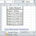
Preparation of the target table data
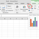
Select your data and go to insert > column chart and select clustered column chart. The B column represents the goal line, and the C column represents your data.

Inserting a sales target chart
Right-click the blue bars, which are expected sales, and select change series data chart type.

A dialog box will appear.

Change expected sales to a chart-type line with markers. Now click “OK”.

The final result will be like this:

Once you’ve finished formatting the goal line, you can save the chart and use it in your Excel workbook or other applications.
These steps should help you add a goal line to an Excel graph. You can use this technique with various types of charts, such as bar charts, column charts, or line charts, depending on the type of data you’re working with and the message you want to convey.

Leave a Reply