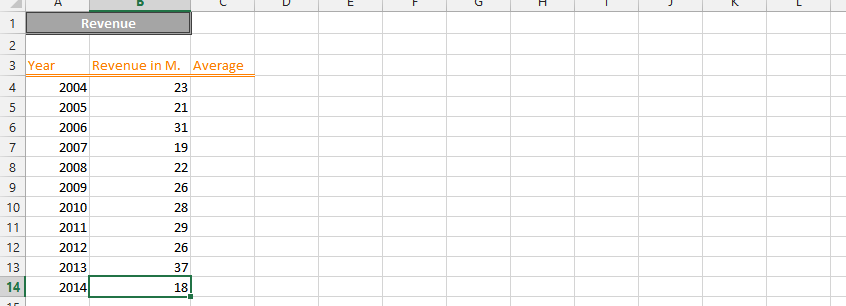
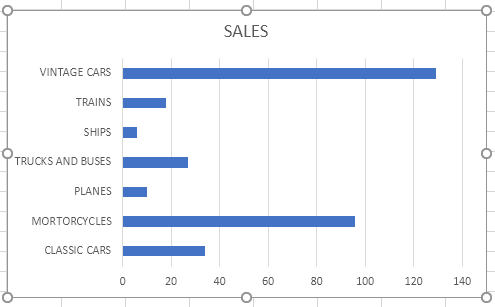
Best Excel Tutorial

The Largest Excel Knowledge Base ✅ The Best Place to Learn Excel Online ❤️

VBA own function table

How to Create Vba Function in Excel

Excel offers a large number of built-in functions that you can use to perform many different tasks easily and quickly. But at least once, you might have felt that the built-in functions provided by Excel are not enough for you to perform some complicated task.

In such cases, you will have to write your own functions, and this is done using VBA. VBA stands for Visual Basic for Applications. Moreover, whenever you have to use a block of code repeatedly, it is advisable to create a function so that you can reuse the code easily.

Read More

Monitor Stock Prices from web

How to Get Stock Quotes in Excel

If you are an investor who invests in stock, then you might be knowing how important is monitoring the stock prices. You might have to make wise and quick decisions based on the stock prices. There are a number of financial websites like Yahoo Finance, Forbes etc that you can view to monitor stock prices.

The happy news is that you can even use Microsoft Excel to monitor the performance of your investments. You can set up your Excel in such a way that all the details you need for the stocks of your interest can be viewed and updated easily and quickly.

Read More

Yahoo Apple

How to Calculate Beta of a Stock in Excel

Stock beta is a measurement of the risk of a particular stock relative to the risk of the entire stock market. Before choosing a particular stock for your portfolio, you can check the beta of that particular stock to decide how risky it is.

Though beta is not the only factor to consider before investing in a stock, you can make a wise decision by considering beta as well.

Read More

four axis chart example

How to make 4 Axis Graph

Radar charts, also known as spider charts, web charts or star charts, are used to evaluate multiple alternatives based on multiple criteria. You need to use a radar chart when you have to display multivariate data in the form of a chart that has three or more axis.

For example, you can use a radar chart to analyze the strengths and weaknesses of a number of supply chain strategies or to compare multiple projects graphically. Given below is a simple radar chart with 5 axes on a scale of 0 to 10.

Read More

Percentile Data

How to Calculate Percentile?

If you have written any competitive exams, you might be familiar with the term percentile. Most of today’s competitive entrance exams publish the results of the applicants based on percentiles. You might be familiar with the term percent. But, it is not the same as percentile.

Do not confuse these terms. As we all know, percentage is a number defined as a fraction of 100. So, if a person says that he scored 60% marks in his GMAT exam, then it means that if total score is 100, he scored 60 marks.

Obviously, if the total score is 50, the person has got 30 marks in the exam.

Read More

Root Result

How to Calculate Nth Root in Excel

Excel is equipped with a variety of built-in functions that make calculations simple and efficient. While common functions like AVERAGE, SUM, and SQRT are frequently used, finding the nth root of a number requires a bit of mathematical manipulation since Excel doesn’t have a direct nth root function. Here’s how you can calculate the nth root, including the square root, cube root, and other roots.

Read More

What IF Analysis Data

How to Use What If Analysis in Excel

What-If Analysis in Excel allows you to explore how changing input values affect calculated outcomes, essentially working in reverse of standard formulas. Instead of using known inputs to determine an output, What-If Analysis helps you find the input required to achieve a desired output.

This technique is applicable to various scenarios, such as budget planning, investment analysis, and retirement savings projections, with Goal Seek being a prominent tool within this suite.

Read More

Ishikawa Scheme

How to Create Ishikawa Fishbone Diagram in Excel

The Ishikawa diagram, popularly known as the fishbone diagram or the cause and effect diagram, is mainly used in quality management. It is used to analyze inefficiencies of processes. Thanks to the fishbone diagram, we have the opportunity to analyze the problem that is visible in the process.

The Ishikawa Diagram is a tool that will detailly identify the root causes of this problem. In other words, an ishikawa diagram can help identify defects in processes by analyzing the root causes of the problem.

Read More

Trig Functions Table

How to Use Trig Functions in Excel?

Trigonometry is a branch of mathematics that studies the relationships between the elements (sides and angles) of a triangle.

You may recall many trigonometric formulas and equations from your school or college days. Some of them are cot x = 1/tanx , six x/cos x = tan x, sin(900-x) – cos x and so on.

Excel offers a number of built-in functions that deal with trigonometry. You can use these trig functions to solve complex trigonometric expressions.

Read More