How to Break Chart’s column?
There is simplicity in breaking the column of a chart, and we are going to justify this simplicity. Follow along as I demonstrate how to break one column in Excel.
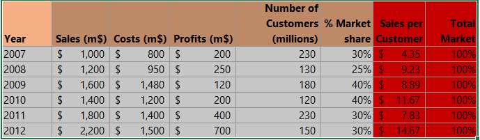
First, examine the data in the example chart that we want to break the column on:

Create a new table titled “Break Info”. In this table, define the break point where you want the column break to occur, and specify the resume point where the column should continue after the break.

Click on the value beside max in your new table (1), and type Break_Max in the name box (2).

Note: Repeat this step on the rest of the data, using SPLIT_RESUME, SPLIT_BREAK, and SPLIT_MIN, as the name.
You should create a new table, with the original data. Start with the labels.

Breaking a column
Click on a cell beside new label (1), and type in =IF(B4>SPLIT_BREAK;SPLIT_BREAK;B4) (2).

Double-click on the small square selector icon that appears when you click on the formula result.

Click under break (1), and type =IF(B4>SPLIT_BREAK;1;NA()) (2).

Double-click on the small resize handle to apply the break point.

Click under continue (1), and type ==IF(B4>SPLIT_BREAK;B4-SPLIT_RESUME;NA())
Double-click on the small square.

Mark between G3 and J15 (the new data).

Inserting a 2d bar chart
Click on insert (1), column chart (2), and choose 2D chart bar (3).

Right-click on the break (1), select white color in fill (2).

Note: Repeat this on to continue series, and then double-click on continue, and break in the legend series, and press delete on your keyboard.
We just created a chart with the break in one column. You can keep working on the chart, doing things like changing the “Original” series name. This is how our chart looks like, with a broken column.


Leave a Reply