How To Insert a Variance Graph
You certainly know how to calculate a variance in Excel. But do you know how to insert variance graphs?
Variance charts in Excel can be used when you wish to compare two sets of data, for example, if you wish to compare the sales forecasts to the actual sales over a period.
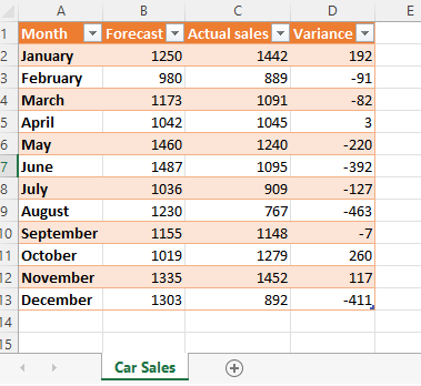
You will need to have the data listed within a table before generating the chart. The table must have labels clearly identifying the actuals vs. predicted figures and the variance, which is the difference between those two figures.
For the purposes of this guide, sample data has been created for you to use. In the sample data, the scenario is of a manager of a car dealership wishing to chart predicted car sales versus actual car sales over a year.
Steps to create a variance chart
The steps below will take you through the process using some sample data. A quick reference guide is available at the end of this document.
Open the Car sales Excel spreadsheet.
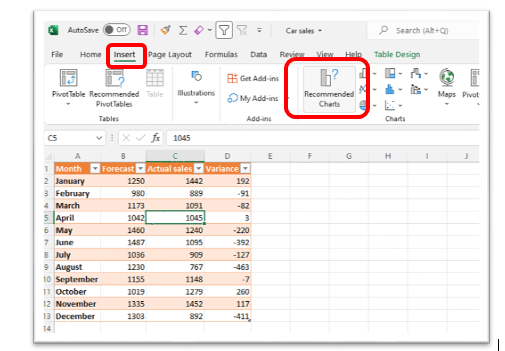
Click anywhere within the data.
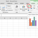
On the menu, select Insert, then click Recommended Charts.
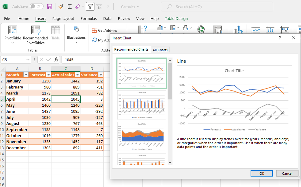
The Insert Chart window opens, on the left, under Recommended Charts click on any of the types of charts listed; a preview of the chart appears on the right. Be sure to select a chart that plots the variance figures (you will see the variance label on the chart). Not all the recommended charts will do this. You will see a line labelled ‘Variance’.
Click the All Charts tab to see additional chart options. As before, select only charts that plot the variance figures.
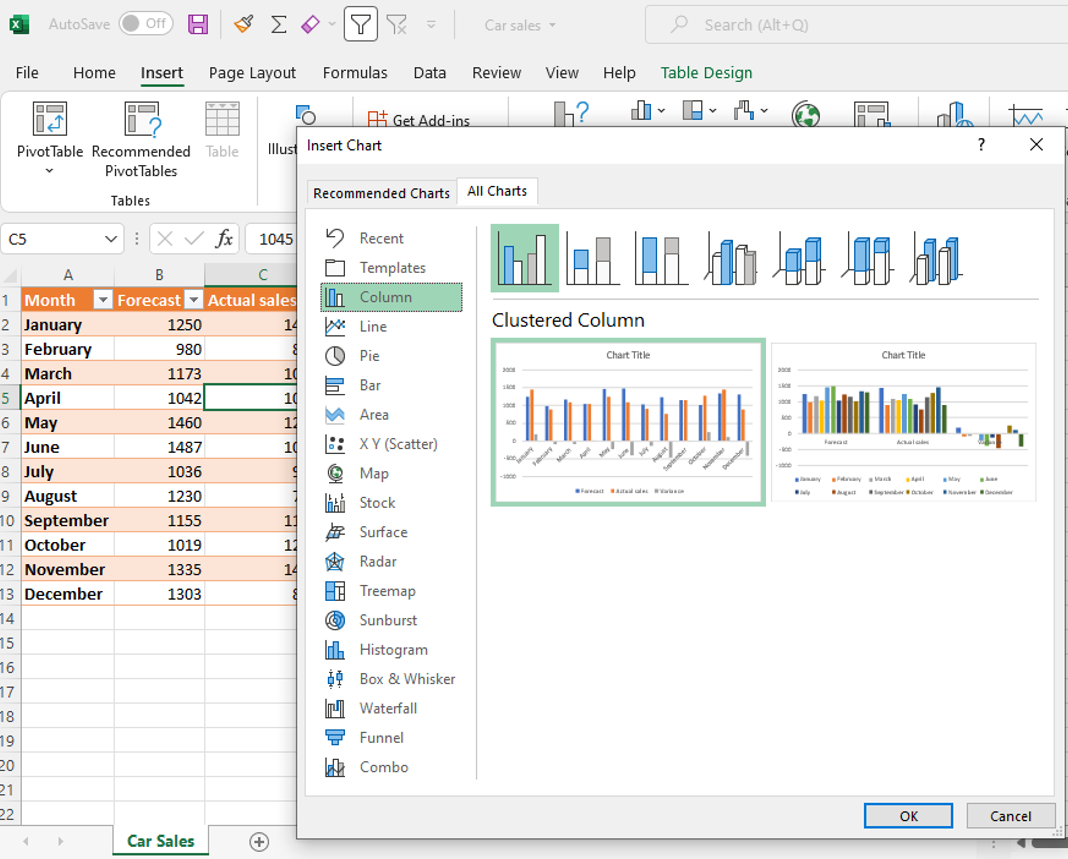
In the All Charts view, hover your mouse over a chart in the preview area to see a larger view of the chart.
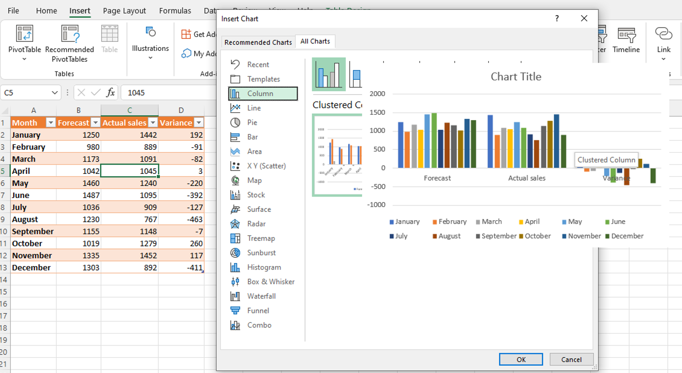
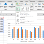
Once you decid on a chart, click OK in the bottom right corner of the window. Excel inserts the chart into the spreadsheet.
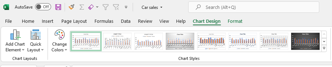
Excel opens a Chart Design tab. Use this to edit the chart as you wish.
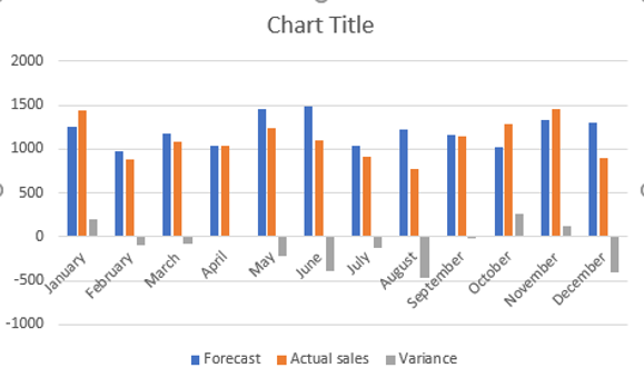
 This is what a Variation Plot looks like:
Quick reference guide
- Open the Excel spreadsheet containing the data you wish to chart.
- Click anywhere within the data.
- On the menu select Insert then click Recommended Charts.
- The Insert Chart window opens, on the left under Recommended Charts click any of the types of charts listed; a preview of the chart appears on the right. Be sure to select a chart that plots the variance figures, not all the recommended charts will do this. You will see a line labelled ‘Variance’.
- Click the All Charts tab to see additional chart options. As before, select only charts that plot the variance figures.
- In the All Charts view, hover your mouse over a chart in the preview area to see larger view of the chart.
- Once you decided on a chart, click OK in the bottom right of the window, Excel inserts the chart into the spreadsheet.
- Excel opens a Chart Design tab, use this to edit the chart as you wish.
Leave a Reply