How to Create Graph from Csv File
In this Excel charting lesson, you will learn how to create a chart from a csv file. It’s useful when you import csv files from other applications or the internet.
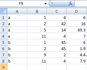
How to create a chart from csv?
Import the date from the csv file into Excel. You can do this by clicking on “File” in the Excel ribbon, then selecting “Open” and browsing to the location of the file on your computer.

Go to the ribbon and click Insert. Choose the type of graph that you want to insert.
On selecting a graph, a blank window will appear. On right-clicking, a drop-down menu appears, from which you can choose the Select Data option.

On the clicking Select Data option, a window will appear like this below. On the left, select the “Add” option.

Visualization of CSV data
A small window will appear. Enter the cell address in Series name, and select the data row by row while holding Ctrl (this option allows multi-selection). This step will plot the numbers in the order you selected.

Repeat the previous step for multiple series A2, A3. You can modify the appearance of the graph by right-clicking on it and selecting “Format Chart Area” or “Format Axis”. This will bring up a menu with options for customizing the look of your graph, such as changing the color of the bars or lines, adding labels, or adjusting the axis ranges.
In the result, you get a graph window like this below.

Your csv to chart conversion is complete. That’s how to insert a chart from a comma-separated value imported file into Excel.
When you’re satisfied with the appearance of your graph, you can save the file by clicking on “File” in the Excel ribbon, then selecting “Save As” and choosing a location on your computer.


Jx
I am in fact glad to glance at this webpage posts which includes tons of valuable data, thanks for providing these kinds of information.