How to Create a Butterfly Chart in Excel (Step-by-Step Guide)
A butterfly chart, which is also known as a tornado chart, is a type of chart used to visualize the changes in the difference between two variables over time. To create a butterfly chart in Excel, you’ll use a stacked bar chart format. It is called a butterfly chart because it resembles the shape of a butterfly, with two “wings” representing the changes in the two variables. This chart is particularly useful for visualizing and comparing changes in the spread between two data sets.
Here is a step-by-step guide on how to create a butterfly chart in Microsoft Excel with detailed instructions:
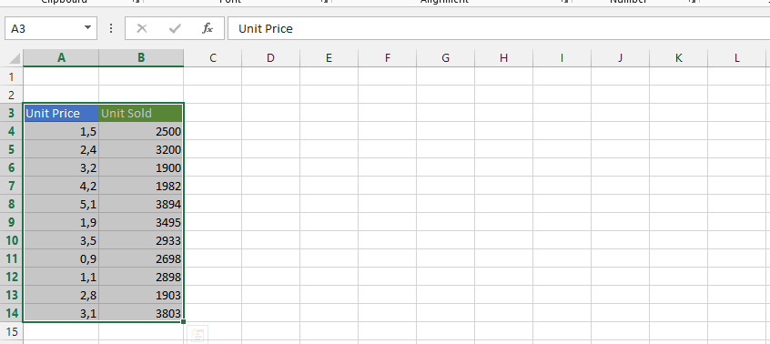
Create a table that contains two columns of data, one for each variable you want to compare. Make sure the data is organized chronologically, with the earliest data first and the latest data last.

How to create the Butterfly Chart?
Click on any part of the data, insert and bar chart, then stacked bar.

Click on Design.

Click on Add chart element, Legends and Top.

Right-click on one of the series and Select Data.

Click on the arrows to sort the series Padding South, South, Gap, North and Padding North.

Right-click on padding North.

Click on no fill.

Note: You should repeat previous steps on Gap, and Padding north series.
Right-click on the gap. Add data labels twice.

Right-click on gap and choose Format Data Labels.

Check category name and uncheck values.

Right-click on the x axis and choose format axis.

Click labels and choose “None” in the labels position.

Click on the line and press delete.

Click on Padding North, Gap and Padding South, and then press delete.

Stretch the legends so both the south and North is showing on their sides.

You can keep working on the chart as you please.

You can download free Butterfly Chart template here.


Leave a Reply