How to Overlay Graphs in Excel
Overlay graphs are a powerful tool for data visualization. They allow you to compare multiple data series on the same graph, which can help you to identify trends and patterns that would be difficult to see if the data was presented in separate graphs.
In this Excel tutorial, you learn how to overlay graphs in Excel. We will also discuss the benefits of using overlay graphs and some tips for creating effective overlay graphs.
Gathering all your data
In this step, we are going to get the data we need for further exploration.
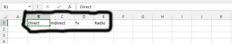
You should start by writing the titles of the data. It is possible for you to determine how many you would like for your overlay to live up to your expectations. But, I would recommend at least two.

You should write the data in a way that is similar to the one shown in the picture below.

You should now choose from the title columns. You can do it by simply clicking on one of the columns, and then clicking on the CTRL button on the computer’s keyboard while using the arrow keys to choose the rest of the columns. Now you should click on CTRL and then press B, which means bold.

Creating a Chart
Click on any of the columns, and then press CTRL and A on your keyboard. This is something that makes you select all of the columns, as you can see in the picture below.

Just click on the insert tab. This is marked in black and titled “number 1”. Click on the chart, and choose the 2d-bar chart, which is labeled as number 2.

You should choose the title that you would like to give the chart.

Overlaying the Charts
We are now going to start overlaying charts. We are going to do so step-by-step.
Click on any of the data series, as it is marked as number 1 in the chart above. You could click on any of its parts.

You should see the design tab showing up. But if you do not, you should just click on it, as it is marked in black and labeled as number 1, and then choose change chart. This is labeled as number 2.

The first thing you should do is click on the “all charts” tab, which has been labeled as number 1. The second thing is clicking on combo, as it is marked as the number 2. If you check beneath the chart that is shown in the picture above, you will see all the series names. You should just choose the chart type, which is the number 3, 4, and 5 in the picture. Choose the type of chart you find suitable for the overlaying of your charts.

Now decide what it would look like while making the overlay of charts. In number 1, we have chosen a different kind of chart, and if you check number 2, you will see how the overlay is taking effect. If you are pleased with the overlay, you should click on number 3, which is OK.

This is the final creation of the overlaid charts.

You can download a free Multiple Overlay chart template here.


Leave a Reply