How to Create a Petal Chart in Excel: Step-by-Step Guide for Data Visualization
A petal chart, also known as a star chart, is a type of radar chart that plots the values of each category along a separate axis that starts in the center of the chart and ends at the outer ring. Petal charts are useful for comparing multiple values across multiple categories.
Preparing Data
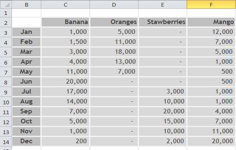
For this petal chart tutorial, use the provided sample data to get similar visualization results. You can easily import this data into your worksheet, or you can use your own dataset for a customized petal chart analysis.
Begin by importing the example spreadsheet data into a new worksheet, or use an existing worksheet containing your data that you want to visualize in this radar chart format.

Select the data that you want to plot in the star chart, including labels.
Inserting Petal Chart
On the Insert tab, in the Charts group, click Other Charts.

Under Radar, click Filled Radar.

If you want to change the color theme of the chart, click on the chart area of the chart. This displays the Chart Tools, adding the Design, Layout, and Format tabs.
On the Design tab, in the Chart Styles group, click the chart style that you want to use.

To change the size of the chart, on the Format tab, in the Size group, select the shape size that you want in the Shape Height and Shape Width boxes, and then press ENTER.


Leave a Reply