How to create a chart with grouped data?
This time you will teach yourself how to group data in your chart. The Excel tutorial may be useful for preparing consolidated chart for report or some kind of summary.
How to group data?
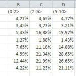
1. Preapare a table and group data there.

2. Select data and under Insert option in toolbar, in Column select first option.
There are several ways to create a chart with grouped data in Excel, including using column charts, bar charts, and stacked bar charts. In this article, we will focus on how to create a column chart with grouped data in Excel.

How to group data in Excel chart?
3. Now in Toolbar under Design option, select Change Chart Type option.

4. Choose Stacked Column option.

5. Here you have your chart for grouped data.

How do I group my data in a PivotChart?
If you have ungrouped data, you don’t have to worry. Manually grouping the data would take you too long. You can group your data with a PivotChart.
Pivot Chart groups your data automatically so you don’t need to do anything else.
I have ungrouped transaction data and I’d like to create a chart from that.

It would be impossible to create a chart based on this data as multiple rows refer to the same customer and salesperson.
When creating a PivotChart, your data will be grouped automatically.

As you can see, the sales data have been grouped and my customers’ transactions have been summed up.
Depending on your data and objectives, choose the appropriate chart type:
- Clustered Column/Bar Chart: Groups data into distinct columns or bars side by side.
- Stacked Column/Bar Chart: Groups data into segments within each column or bar, showing the composition of each group.
- Grouped Column/Bar Chart: Combines aspects of clustered and stacked charts to display grouped data.
PivotCharts are particularly useful when dealing with large or dynamic datasets. You can easily change the grouping criteria by dragging and dropping fields in the PivotTable Field List.
By following these steps and best practices, you can effectively create charts with grouped data in Excel, whether you’re working with manually grouped data or leveraging PivotCharts for automatic grouping and summarization.

Leave a Reply