

Creating charts from non-numeric “Yes/No” data can be helpful for visualizing responses, survey results, or filtering sales reports in Excel. Here’s a refined guide on how to prepare, calculate, and visualize Yes/No data using various types of charts in Excel.
Yes no data preparation
Enter your non-numerical data into an Excel sheet and select it.


Inserting a non-numeric chart
Pivot yes no chart
Go to Insert and click the Pivot Chart button.


A window will pop up.


Now drag the respondents into values and drag the response into legend.


Thus, you will get the chart on your sheet.


Yes no sales report chart
This is the example when you need to prepare data based on a given condition. From the whole sales report, you need to focus on sales above $10,000.
I’ve added an additional column for that purpose to get YES or NO values.
I used if formula: =IF(C4>10000,”YES”,”NO”)


I have created a pivot chart.


Axis (Categories) is days.
Values is the count of yes/no data that I calculated just now.
Thanks to yes no data, I was able to prepare such a sales report pivot chart.
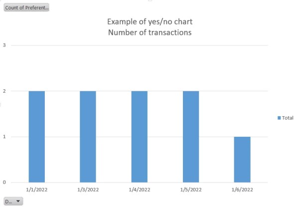
Aggregated yes no chart
Yes no data also allows us to aggregate.
In this case, we have a sales report with 3 customer groups:
- private
- commercial
- vip
Private clients are not preferential to you.
You want to create a pivot chart with sales values. You are only interested in preferential customers.
Create an additional column and, thanks to the if function, aggregate commercial and vip clients: =IF(D4=”Private”,”NO”,”YES”)


Thanks to the preferential column, you are able to create a chart showing how often your key customers make transactions.

Stacked non-numeric chart
Let’s use such an example to examine how to create a stacked chart based on a non-numeric set of data.


To be able to create a stacked bar chart based on such data you need to calculate the data.
In the YES% and NO% rows, I will prepare numeric values for yes and no answers.
The countif formula will let me do that: =COUNTIF(B$3:B$7,”YES”)/COUNTA(B$3:B$7)


As you can see in rows 8 and 9, I calculated data. It is possible to count data in Excel. From non-numeric sets of data I prepared a numeric data set. Now it is obvious to prepare a stacked bar chart.


That’s how you can insert your chart with non-numeric data. You may need it, for example, for illustrative surveys. That’s exactly why it’s also named the “yes or no chart”.


