How to Create 3D Clustered Column Chart
3D clustered column charts are a great way to visualize data in Excel. They are easy to create and can be used to compare multiple data series. In this charting tutorial, we will learn how to create a 3D clustered column chart in Excel.
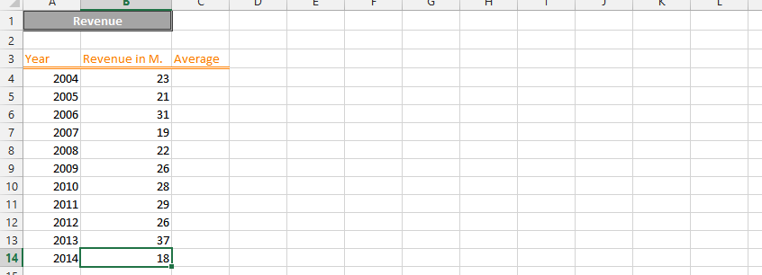
Data preparation
Before creating a 3D clustered column chart, you need to prepare your data. Your data should be in a column format, with the labels in the first column and the values in the subsequent columns.

Select the data that you want to chart.

Creating 3D Clustered Column Chart
Click on the Insert tab.

In the Charts group, click on the Column chart type.

Select the 3-D Clustered Column chart subtype.

We have just created a 3-D chart that looks like this:

For additional customization or to explore different design options, you can search for free 3D chart templates online. These templates can provide a starting point for further customization and may offer unique design variations that can be imported into Excel.
You can download free 3D chart template here


Leave a Reply