How to Graph Negative Numbers
What to do when you have ngative values? Read this tutorial to learn how to insert a chart with negative values in Excel.
Creating a chart with negative data
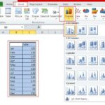
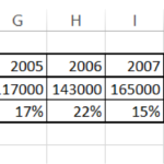
Select you data and go to Insert -> Insert Column Chart.

Click insert column chart and select clustered column chart.

A graph will appear in the Excel sheet. Axis can be adjusted by right clicking on the axis and selecting format axis. (Axis adjustment shown in the next steps).

Adjusting the graph to negative values
Scales can be adjusted by right clicking vertical axis and then selecting format axis. A dialog box will appear. Now adjust the vertical axis accordingly.

You will see the changes in the graph.

Bar chart with negative values
You can also use a bar chart to show negative data. A bar graph with negative values looks like the image below.
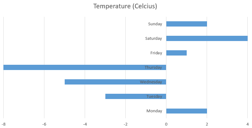
As you can see, the problematic part of the bar chart is that labels are obscured by negative bars. They are hard to read.
Line chart with negative values
In the picture below, I showed what a line graph with negative numbers looks like.
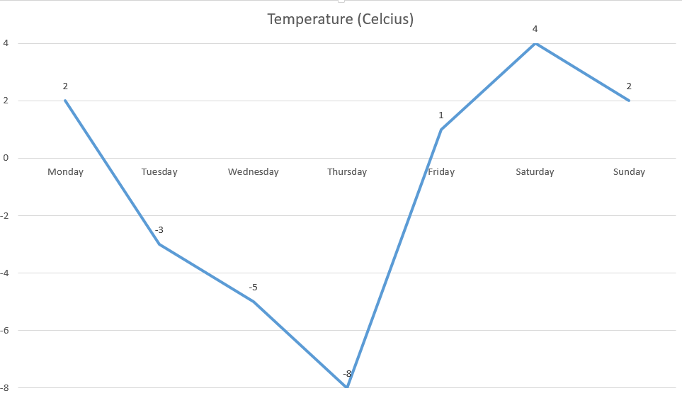
For line graphs with few lines, I recommend adding data labels.
Column and bar charts are much better for showing negative data. You can clearly see which bar or column is showing negative data. In a line chart, it is not so clear which numbers are negative and which are positive.
Other types of charts are less suitable for showing negative numbers in the chart.
You can also show negative data in stacked and clustered charts.
Leave a Reply