Chart with number and percentage
In this Excel charting tutorial leasson, you will learn how to create a chart with number and percentage. You will need it to show both numbers and part of a whole or change using percentage.
How to add number and percentage in chart
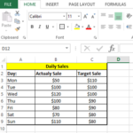
First you need a table of data. It is a net worth and its change over last years in this example.

How to create a chart with both percentage and value
Next, go to the ribbon and select the Insert tab. Click the Insert Combo Chart button. Choose the second one (Clustered Column chart – Line on Secondary Axis).

You will see a percentage chart similar to this.

How to add a percentage to a number
You should do some formatting:
- format data as currency and percentage
- set years to horizontal data labels
- change chart title
- add data labels
- set min and max axes values
- change colors
Your final chart with number and percentage should look like this:

You can also customize the chart further by changing the colors, styles, and labels as needed.

Leave a Reply