How to Make a Chart with Subcategories
There is one important thing in charts. Good labeling. That’s why it is useful to be able to insert professional labels that share the chart into subcategories.
Chart with Subcategories
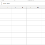
Enter data into an Excel sheet in the following manner. Make sure your data is organized in a way that includes both the main categories and the subcategories. The key point here is to use proper, correct labels. In column A, you write subcategories, and in column B, you write the names of particular columns of data.

Now highlight the data and go to the ribbon. Select insert tab and click clustered column chart.

As you see, there are subcategories on the chart. Now your chart is clear and useful.
Format the chart.
Add data labels: Right-click on a data point and select “Add Data Label” to display the values on the chart.
Customize the chart: You can further customize your chart by adding titles, gridlines, and trendlines, etc.
Leave a Reply