How to Make Surface Chart
You are going to learn how to insert a surface chart, and it will be easy to perform.
Data preparation
Data Preparation is a crucial step in creating a Surface Chart. The following are the key aspects of Data Preparation:
- Selection of Data to be plotted: The first step in Data Preparation is to select the data that you want to plot on the Surface Chart. This could be any type of data that has three variables. The data should be relevant to your research question or analysis.
- Types of Data that works well with Surface Chart: Surface Charts work well with data that has three continuous variables.
- Pre-processing of Data (if needed): Once the data has been selected, it may need to be pre-processed before it can be plotted on a Surface Chart. This could involve cleaning the data, filling in missing values, or scaling the data to ensure that all three variables are on a similar scale.
- Formatting of Data for Surface Chart: Finally, the data needs to be formatted in a way that can be plotted on a Surface Chart. This typically involves organizing the data into a table format, with each row representing a unique combination of the X and Y variables, and the corresponding Z-value (the third variable) in the third column. In some cases, the data may need to be transformed or aggregated to create the appropriate format for the charting software being used.
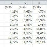
In our simple example, we will use data about an imaginary company as in the image below. The data would be used for creating the chart:

Note: Before you create a surface chart, there must be at least two different data points.
Mark all the data:

Inserting the surface chart
Click on Insert, and then on Recommended Charts.

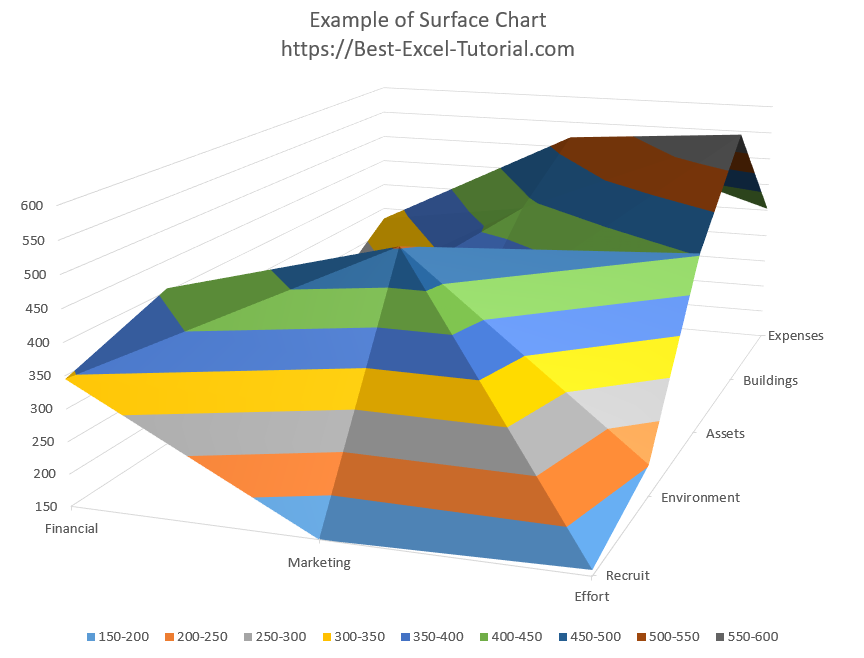
Click on All Charts, and then Surface, and choose the design of the 3D surface chart.

The surface chart is ready. Now you can proceed with the formatting of your surface chart.

Format the surface chart
The design and formatting of the Surface Chart can have a significant impact on how well it communicates the insights from the data. Consider using a clear, easy-to-read font and color scheme, and avoid cluttering the chart with unnecessary elements. A clean, simple design can help to focus attention on the key insights from the data.
The surface chart is very sensitive to outliers. One value significantly different from the others may distort the visibility of the surface chart.
At this stage, you should look at the data. Perhaps there is a typo there? If so, it should be corrected so that there is not too much data difference.
This should improve the visibility of the surface chart. To improve it even more, the axis scale should be corrected. The minimum value and the maximum value should match your data.
You can confirm for yourself that data visibility is now much better.
If you are still not satisfied with the data visibility, you can change it with this clever trick.
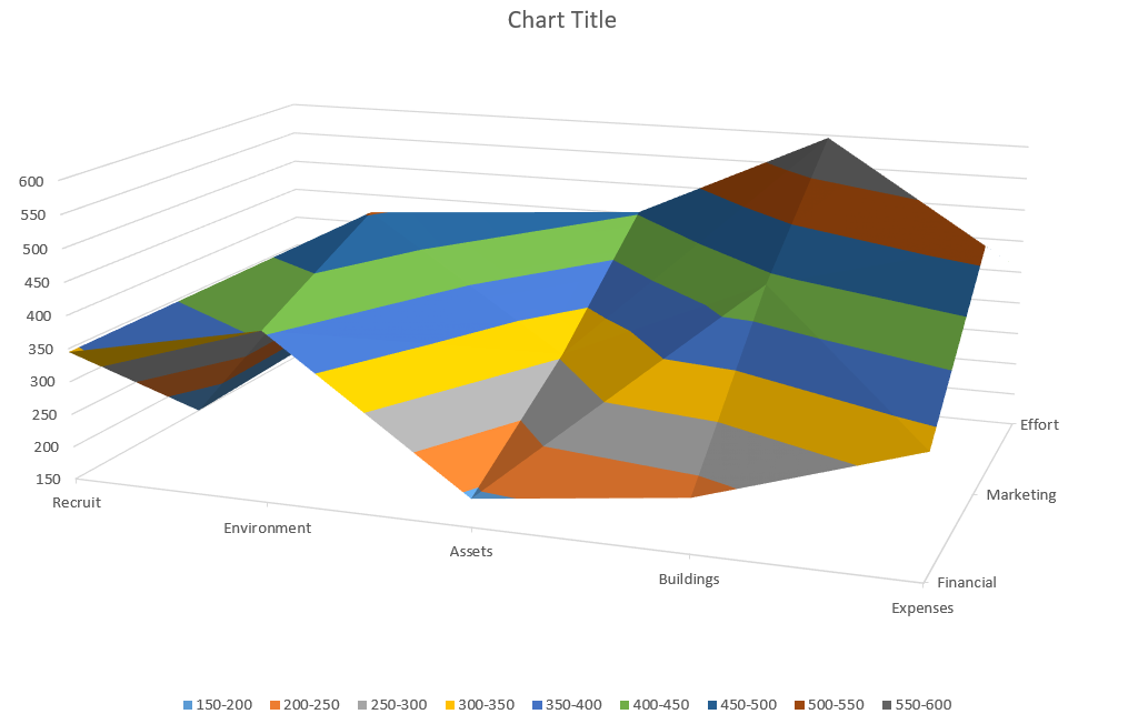
Click on your surface graph. Go to Ribbon> Design> Switch Row / Column.
Now, you will get the view from a different point of view as the columns and rows have been swapped.
If the data on your plot is covered you can also flip the scales. Just click on it and choose from the menu:
- series in reverse order
- values in reverse order
- categories in reverse order
Depending on what you want to change. Try all of these options and choose the one that offers the highest visibility.
If none of these possibilities meet your expectations, you can also change your data table. It’s a good idea to sort the data from largest to smallest. The largest is on the left and the smallest on the right. So that the values on the chart do not overlap.

Leave a Reply