Learn Charts in Excel for Beginners
Excel charts are a great way to visualize data and make it easier to understand. They can be used in reports, presentations, and other documents to help you communicate your ideas more effectively.
This article will teach you how to create charts in Excel, even if you’re a beginner. We’ll cover the basics of chart types, how to select data for your chart, and how to customize your charts.
What are Charts?
A chart is a graphical representation of data. It can be used to show trends, patterns, and relationships in data. There are many different types of charts, each of which is best suited for a different type of data.

Types of Charts in Excel
The most common types of charts in Excel include:
Column chart
Column charts are used to show comparisons between different categories of data.

Line chart
Line charts are used to show trends over time.

Pie chart
Pie charts are used to show the relative size of different parts of a whole.

Bar chart
Bar charts are similar to column charts, but they are used to show comparisons between different categories of data that are not continuous.

Area chart
Area charts are similar to line charts, but they show the cumulative total of the data over time.

Scatter chart
Scatter charts are used to show the relationship between two variables.

Stock chart
Stock charts are used to track the price of stocks over time.

Surface chart
When you show two sets of data.

Doughnut chart
Similar to pie chart but can include few data series

Bubble chart
It’s a kind of surface chart. Use it when you show three series of data. Bubble chart is often used for financial data to show difference between values.

Radar chart
A good way to display one or more variables for the two-dimensional diagram, wherein each arm presents another variable. The line connects all the data points from a spreadsheet along each arm.

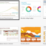
That are basic charts which you can insert in Excel. There are many more types of charts. On this website you can find many lessons about charts in Excel. Not only basics.


Leave a Reply